Responsive Contact Form Landing Page (HTML, CSS and JS)
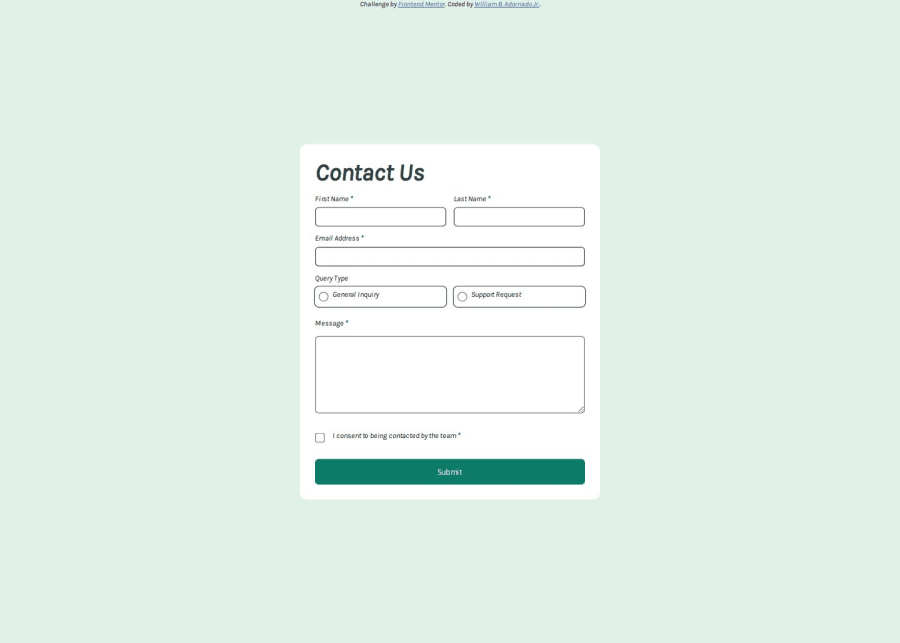
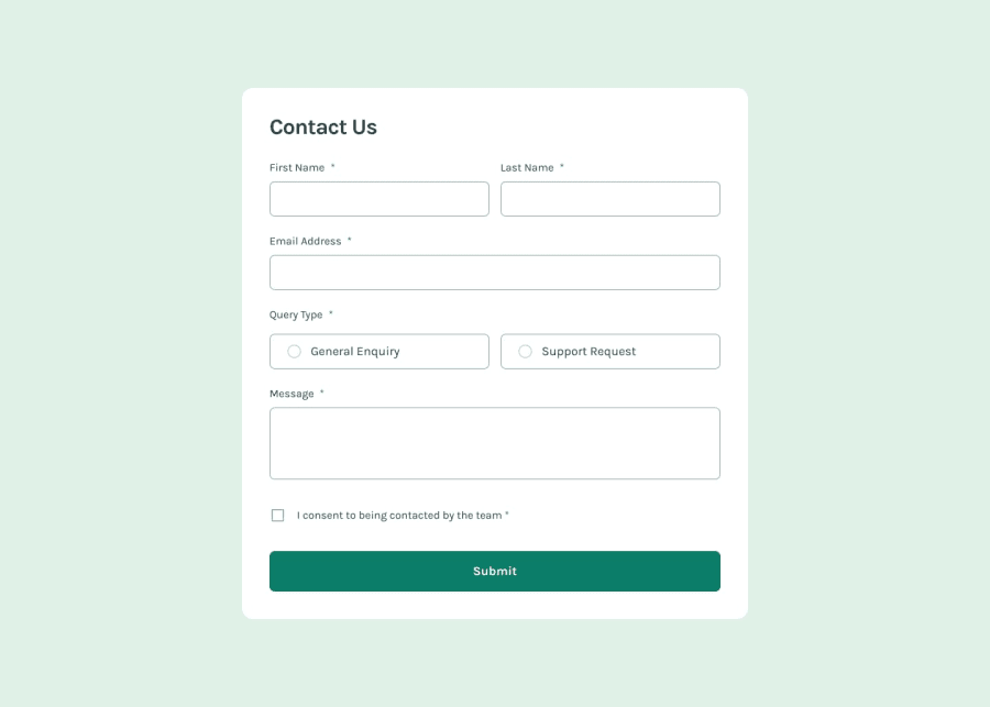
Design comparison
Solution retrospective
Maybe I will try to use some library to make much better to see the user/ clients.
What challenges did you encounter, and how did you overcome them?The alignment of the checkbox and radio buttons to the label.
What specific areas of your project would you like help with?N/A
Community feedback
- @MarziaJaliliPosted 6 months ago
well done buddy 🙌, The only thing to consider is that your elements are not aligned, to solve this, you can use display: flex; or display: inline-flex; and assign the align-items property to center align-itmes: center; hope it was helpful 😁😁
Marked as helpful1@Adornadowilliam2Posted 6 months ago@MarziaJalili Thanks for the advice! I am new here and looking for a site to help me improve my skills. I will take note of that.
0@MarziaJaliliPosted 6 months ago@Adornadowilliam2
any time 😁😁 I am also a newbie don't really know that much. I am self tought and struggling with making progress. Would you mind sharing some tips that you follow? I would be glad to follow up with you.Marked as helpful0
Please log in to post a comment
Log in with GitHubJoin our Discord community
Join thousands of Frontend Mentor community members taking the challenges, sharing resources, helping each other, and chatting about all things front-end!
Join our Discord
