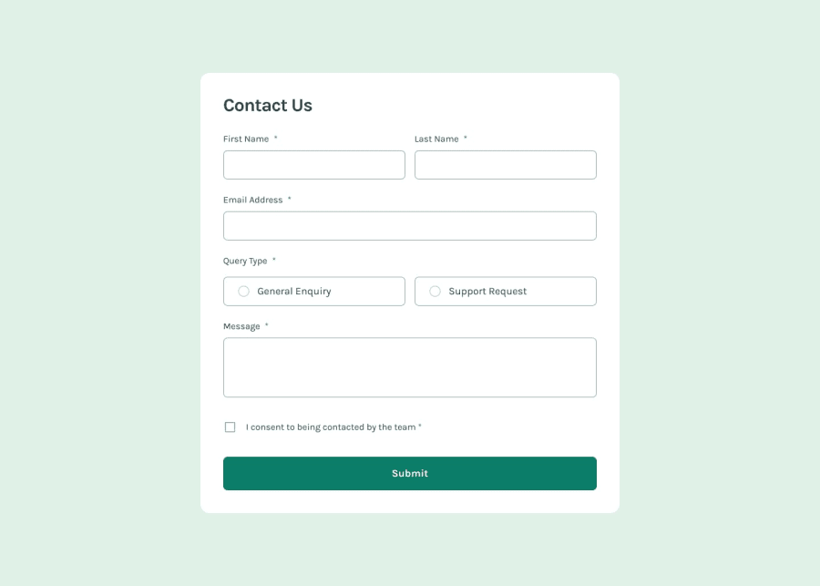
Design comparison
SolutionDesign
Solution retrospective
What are you most proud of, and what would you do differently next time?
Comprehensive Validation:
- The validation logic is thorough, checking all required fields and ensuring the email format is correct.
- User-Friendly Error Messages: Clear and specific error messages are displayed to guide the user in correcting their input.
- Responsive Design: The form is designed to be responsive, adjusting well to different screen sizes using media queries.
- Popup Confirmation: The confirmation popup provides a pleasant user experience by acknowledging successful form submission.
1.Form Validation Logic: Ensuring that all fields are properly validated and error messages are appropriately displayed. 2.Responsive Layout: Designing the form to be responsive and look good on different screen sizes. 3.Popup Functionality: Implementing the popup message in a way that is both functional and aesthetically pleasing.
Community feedback
Please log in to post a comment
Log in with GitHubJoin our Discord community
Join thousands of Frontend Mentor community members taking the challenges, sharing resources, helping each other, and chatting about all things front-end!
Join our Discord
