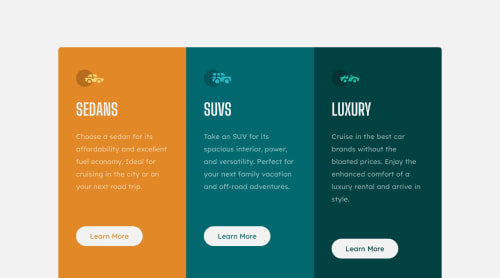
Submitted about 2 years agoA solution to the 3-column preview card component challenge
Responsive Component with CSS Grid
@TonyAppiah

Solution retrospective
Hello.
So this was me practicing my CSS Grid muscles😁...I went a bit extra to design the component at three breakpoints instead of two, manipulating the layout accordingly, thereby getting more practice. I'm still a newbie so I will really appreciate your constructive criticism of my code and your opinion(s) on what I could have done better, generally or specifically. Thank you very much.
@kxnzx and @beowulf1958...I'm practicing the mobile-first workflow as well and so far, so good.
Code
Loading...
Please log in to post a comment
Log in with GitHubCommunity feedback
No feedback yet. Be the first to give feedback on Tony Appiah's solution.
Join our Discord community
Join thousands of Frontend Mentor community members taking the challenges, sharing resources, helping each other, and chatting about all things front-end!
Join our Discord