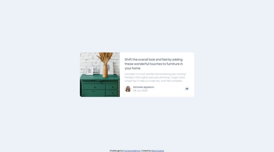
Design comparison
Solution retrospective
I would appreciate any general feedback or improvements. I have following queries in particular:
Q1) Is there a specific width below which is considered a mobile view?
Q2) Which CSS properties are recommended or best practice to be kept defined for the whole application, i.e., in *{ }
Community feedback
- P@norman02Posted over 4 years ago
This looks very good! Only a little off from the design.
The answers to your questions are pretty subjective but here is what I do:
For mobile view I usually play around with the responsive design on google developer tools and set media queries where things start to break. I also us Sizzy to see several devices at once while I'm developing.
The reset css I usually use is
:root { font-size: 10px; } *, *::before, *::after { margin: 0; padding: 0; border: 0; font-size: 100%; font: inherit; vertical-align: baseline; z-index: 0; box-sizing: border-box; } ```2@rahulxyzPosted over 4 years ago@norman02 Thankyou for the feedback. A different perspective is always good.
0
Please log in to post a comment
Log in with GitHubJoin our Discord community
Join thousands of Frontend Mentor community members taking the challenges, sharing resources, helping each other, and chatting about all things front-end!
Join our Discord
