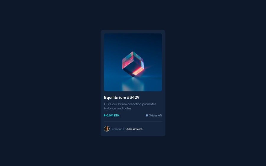
Responsive component using html and css with media queries
Design comparison
Solution retrospective
Hey guys, in my last projects I received several feedbacks advising me to make a more semantic html. I did the best I could but I'm still confused when to use <section> and <article> for example. I also tried to use "rem" instead of pixels, but I still have doubts about how it works. And finally, is there any better way to implement the icon overlay?
Thanks for the feedbacks, they help a lot!
Community feedback
- @Mahmoudamin11Posted over 1 year ago
rem => stands for the root which is html like font Size for example in the root it is always 16px so if you used 2rem it means 2 * 16 = 32px
em=> stands for the body which is my default it's like html but you can change it like body {font-size: 15px;} in this case you made the font size em = 15 so font-size: 2em; means 30px ;
- Awesome work by the way : )
Marked as helpful1@BrunnoHibbelnPosted over 1 year ago@Mahmoudamin11 Understood, thank you very much!
0 - @GiDDeRoPosted over 1 year ago
Hey There,
<article> Generally text-based content, <section> For any other...1
Please log in to post a comment
Log in with GitHubJoin our Discord community
Join thousands of Frontend Mentor community members taking the challenges, sharing resources, helping each other, and chatting about all things front-end!
Join our Discord
