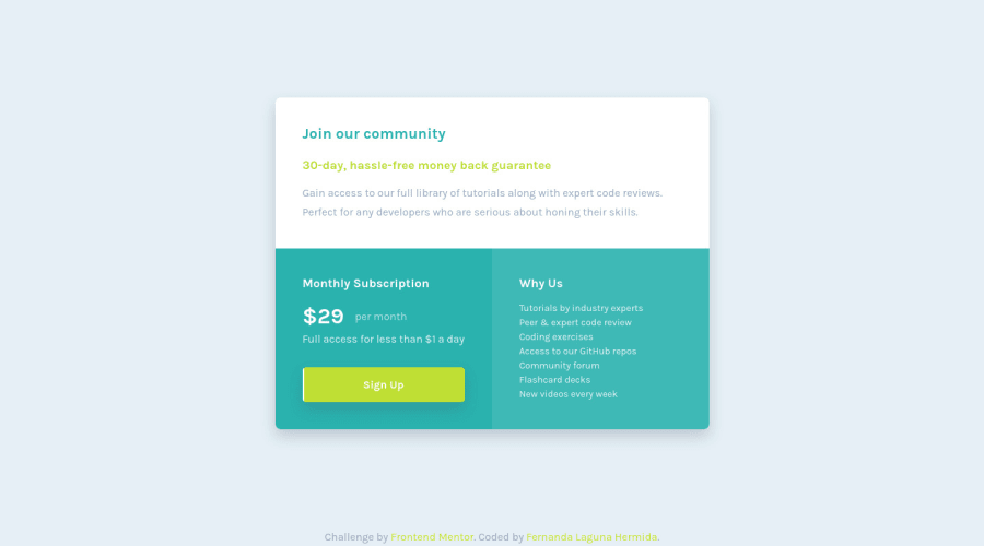
Responsive component using Grid and Flexbox + Small animation ✨
Design comparison
Solution retrospective
Go hover and click the button, please! <3
Community feedback
- @elaineleungPosted over 2 years ago
Hi Fernanda, I clicked the button, and it's indeed all kinds of awesomeness :) You component works and looks great, and reponsiveness is also well done. Code is clean and readable as well, which is most important! If I need to suggest just one thing, I'll say you can have try having descriptive class titles; instead of
card__left, trycard__subscription. That way, someone else reading (like me) would know what you're referring to; you may be surprised that some people get "left" and "right" wrong (as in, not right).Great job again, love the animation, and looking forward to more!
Marked as helpful1@ferlagherPosted over 2 years ago@elaineleung Thank you very much for your comment, it's very appreciated! <3
You are right, I never thougth about that, but many times I found myself wondering about which side is right and witch it's left! I will change that, thank you!
0 - @CarvalhoVincentPosted over 2 years ago
Nice animations for your buttons in your last 2 projects , I really like it 😄 Eager to see your next solutions !
1@ferlagherPosted over 2 years ago@CarvalhoVincent Thank you for your compliments! I'm glad you like it.
0
Please log in to post a comment
Log in with GitHubJoin our Discord community
Join thousands of Frontend Mentor community members taking the challenges, sharing resources, helping each other, and chatting about all things front-end!
Join our Discord
