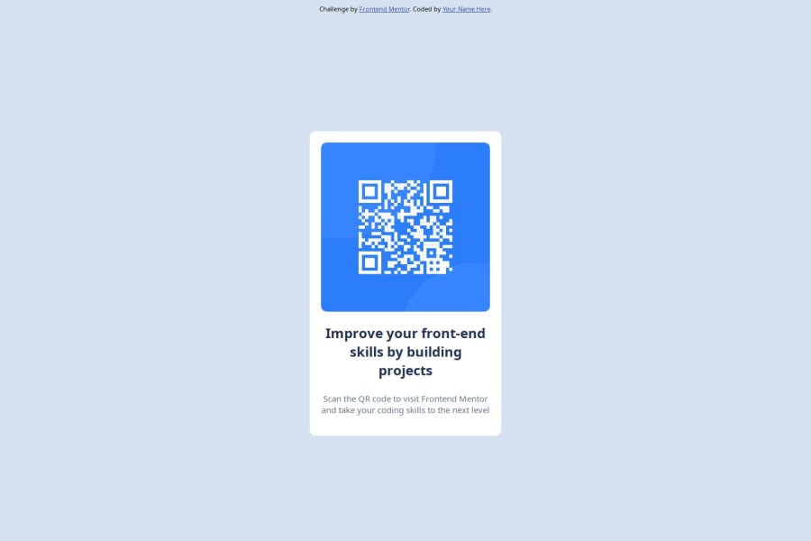
Design comparison
Solution retrospective
The most proud things I did in this project is I finally write a README.md
What challenges did you encounter, and how did you overcome them?Theres no specific challenges. I'm just happy that I go back to learn about the basic of web development
Community feedback
- @DylandeBruijnPosted 4 months ago
@Fikriraihan
Hiya! 👋
Congratulations on your solution, it looks very close to the design! I can tell you put a lot of effort into it.
Things you could improve ✍️
-
I suggest adding a bit of
padding
to yourbody
element so the card has some space around it on smaller viewports. -
Try experimenting with the CSS layout tool Flexbox, it will help you greatly structuring elements on your webpage.
-
You could add a
min-height: 100vh
to yourbody
element so it takes up the full height of the viewport while still being able to grow when the content inside it grows. -
Try experimenting with CSS variables, they help you make your CSS values more reusable across your code.
-
I suggest using clear descriptive CSS classes like
.card
,.card-title
and.card-description
. -
Try using semantic HTML elements like
main
,section
andarticle
.
I hope you find my feedback helpful! 🌟
Let me know if you have more questions and I'll do my best to answer them. 🙋♂️
Happy coding! 😎
1 -
Please log in to post a comment
Log in with GitHubJoin our Discord community
Join thousands of Frontend Mentor community members taking the challenges, sharing resources, helping each other, and chatting about all things front-end!
Join our Discord