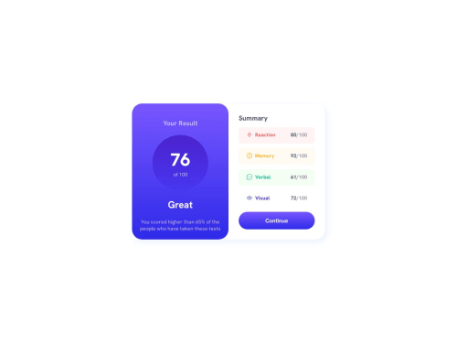
Design comparison
Solution retrospective
- I'm confused about the heights.Should I add height to the parent component or just let the height grow as the content increases.
- I believe I have used html headings in a wrong way.Should I always use headings in a sequencial manner? like h1, h2, h3?
- Should I be using landmarks in the component?
- Which color model I should generally be using. I used both hex and hsl
- Some tips for creating responsive components
Community feedback
- @justinconnellPosted 10 months ago
Congrats on submitting your solution!
Thanks for clarifying what feedback you're looking for - this is very helpful to reviewers.
In response to your concerns:
- I'm confused about the heights.Should I add height to the parent component or just let the height grow as the content increases.
This really depends on whether the height should be fixed or responsive - generally a good way to go is to work top down, get your HTML structured then apply layout to that.
- I believe I have used html headings in a wrong way.Should I always use headings in a sequencial manner? like h1, h2, h3?
You can read all about that take on stack overflow
- Should I be using landmarks in the component?
What are landmarks?
- Which color model I should generally be using. I used both hex and hsl
Either way is fine - just pick one and use it consistently
- Some tips for creating responsive components
One of the most popular methods is 'mobile first' where you build out your default layout for mobile the add breakpoints at each screen width increment you need ton modify the layout.
Using CSS Grid and Flexbox are good technologies to leverage for responsive layouts - Flex is great for row/column - dimensional layouts where Grid is best for 2-dimensional layouts
I hope you find this response helpful...
1 - @Ezekiel225Posted 10 months ago
Hello there ๐ @shrabanchakma.
Good job on completing the challenge !
Your project looks really good!
I have a suggestion about your code that might interest you.
There is an very useful browser extension called Perfect Pixel that allow you compare with the design image and thus see the exact dimensions. I recommend it to you.
I hope this suggestion is useful for future projects.
Other than that, great job!
Happy coding.
1 - @petritnurediniPosted 10 months ago
Congratulations on completing your Results Summary Component project! ๐ It's a fantastic achievement to see your project come to life with such a thoughtful design and functionality. Here are some best practices and recommendations to further refine your work:
-
HTML Structure and Semantics:
- Great use of semantic tags such as
<div>
and<h1>
. Consider adding<article>
or<section>
tags for different parts of the summary to enhance the semantic structure. - Ensure your
<img>
tags always have meaningfulalt
attributes for accessibility.
- Great use of semantic tags such as
-
CSS Best Practices:
- You've done well with organizing your CSS. Keep up with consistent ordering of properties (like positioning, box model, typography) for readability and maintenance.
- Be cautious about using
vw
andvh
units in absolute positions as it can cause layout shifts on different screen sizes. Testing across multiple devices can help you spot these issues.
-
Responsive Design:
- Check your design on various devices and screen sizes to ensure it remains visually appealing and functional. Pay close attention to how the layout adapts to smaller screens.
- Use media queries effectively to adjust elements and fonts for better readability and usability on mobile devices.
-
JavaScript Best Practices:
- Good job on implementing asynchronous functions for fetching data. This is a solid practice for handling network requests.
- Consider handling cases where data might not be available or the network request fails. Providing user feedback in such scenarios enhances user experience.
-
Accessibility:
- Make sure all buttons and interactive elements are accessible. This includes providing
:focus
states alongside:hover
for keyboard navigability. - Test your color contrasts to ensure they are accessible to users with visual impairments.
- Make sure all buttons and interactive elements are accessible. This includes providing
-
Performance Optimization:
- Optimize images and icons used in your project to reduce the load time, particularly important for users on slower connections.
-
Code Cleanliness and Documentation:
- Keep your code clean by removing commented-out code blocks that are not in use.
- Add comments to your JavaScript and CSS files to describe the functionality of complex sections or logic.
References for Further Learning:
- HTML and CSS Best Practices: MDN Web Docs
- Responsive Web Design: A List Apart
- JavaScript Asynchronous Programming: JavaScript.info
- Web Accessibility Guidelines: W3C
Keep exploring new challenges and technologies to continue growing as a developer. Your journey so far is impressive, and I'm excited to see what you'll create next! Keep coding and keep learning! ๐ป๐
0 -
Please log in to post a comment
Log in with GitHubJoin our Discord community
Join thousands of Frontend Mentor community members taking the challenges, sharing resources, helping each other, and chatting about all things front-end!
Join our Discord