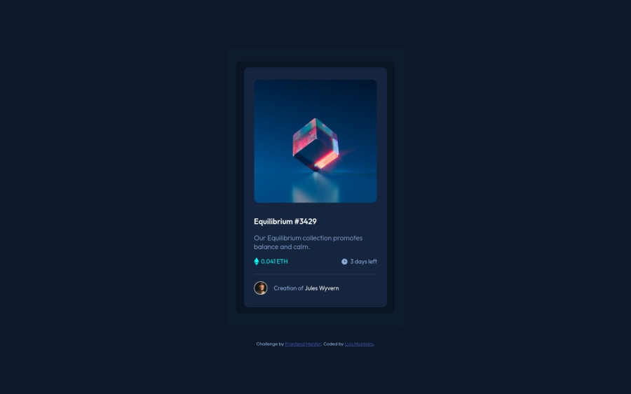
Design comparison
Solution retrospective
I'd like to structure my CSS better and create reusable classes through CSS methodologies. Is BEM a good Methodology? What is the best way to learn about it? Does my solution present a good responsivity?
Community feedback
- @pikapikamartPosted almost 3 years ago
Hey, awesome work on this one. The overall layout of the site I think looks fine, just needed for the
box-shadow
to be smoother, currently it has this solid shadow.Others already gave their feedback on this one which is nice, just going to add some suggestions as well:
- Avoid using
height: 100%
orheight: 100vh
on a large container like thebody
as this makes the element's height capped based on the viewport/screen's height. Instead usemin-height: 100vh
so that the element will expand if it needs to. - Always have a
main
element to wrap the main content of the site. For this usemain
tag on the.card-underlay1
selector. - For the
.attribution
, it would be nice to replace thediv
with afooter
tag so that it will be its own landmark element. - For the image's interactivity, since it is treated as an interactive component because of the hover effect right, it would be really great to have an interactive element alongside with it. You can use
button
if you think clicking the image would show a pop-up where the user can see the full nft or ana
tag if you think clicking the image would take a user in another page to view the full nft. I haven't made this one yet so I can't provide a reference on it, sorry for this one, but I hope you kind of get the gist of what I said:> - The overlay-image when hovering on the nft image should be hidden since it is only a decorative image. Decorative images should be hidden for screen-reader at all times by using
alt=""
andaria-hidden="true"
to theimg
tag or onlyaria-hidden="true"
if you are usingsvg
instead ofimg
tag. - For the nft name, again it is being treated as an interactive component right, nesting the
h1
test inside of ana
tag would be really nice:
h1 a: text in here
- Also just saw the
alt
for the clock-icon. When usingimg
tag, you don't need to add words that relates to "graphic" such as "icon" and others, sinceimg
is already an image so no need to describe it as one. - On an image, using
img
tag, if you think that the image is meaningful and really adds content to the site, then use a meaningfulalt
value. But if the image is just acting decoration, then hide it using the method I mentioned above. - For the person's image, you can just use the person's name as the only
alt
value and you can remove the other text inside it. - Lastly, the person's name is interactive as well. Instead of using bold tag (
b
) usea
tag to wrap the person's name.
Aside from those, great job again on this one.
Marked as helpful3@lmonteiro18Posted almost 3 years ago@pikapikamart I really appreciate all the suggestions you made! There are somethings that really are basic and i forgot about them somehow (like wraping things on landmarks) and I will pay more attention from now on! Again, thank you a lot for helping me improve!
1 - Avoid using
- @Nam-HaiPosted almost 3 years ago
To be honest the design is not clear, but I think using box-shadow instead of container with background color would be a better implementation of that darker tone that is around the card.
Marked as helpful0@lmonteiro18Posted almost 3 years ago@Nam-Hai You're right about the possible use of box-shadow, I should have thought of that! (though I would probably still have a div with one of the darker tones because box-shadow would only create one of them)
About the design not being clear, could you elaborate on that (besides the box-shadow aspect) so I can improve it?
0 - @techantherePosted almost 3 years ago
Regarding your question on BEM, this is a resource shared by frontend mentor you should definitely read. It has been explained very well and its benefits as well. BEM resource by frontend mentor.
Marked as helpful0@lmonteiro18Posted almost 3 years ago@techanthere Thank you a lot! I will have a look on the article and hopefully i will improve my knowledge on that matter! It's really something that i've been wanting to put in practice!
1 - @lmonteiro18Posted almost 3 years ago
Updated code files and hosted website with the suggestions made! There's yet a problem with the "a" tag inside the collection image, i can't seem to change its dimensions so it takes the same amount of space the image does (to cover it all)...
0
Please log in to post a comment
Log in with GitHubJoin our Discord community
Join thousands of Frontend Mentor community members taking the challenges, sharing resources, helping each other, and chatting about all things front-end!
Join our Discord