Submitted 12 months ago
Responsive component page using CSS Flexbox

@TheTreeveloper

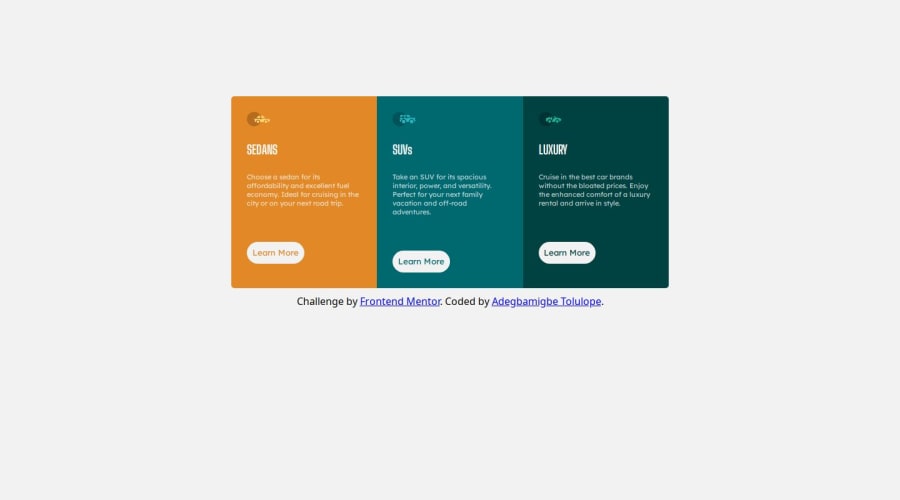
Design comparison
SolutionDesign

Solution retrospective
I am happy with the outcome of my code. I am now able (or so I think) to break down the components to manageable sections where I can determine how I want to structure my component.
Community feedback
Please log in to post a comment
Log in with GitHub
Join our Discord community
Join thousands of Frontend Mentor community members taking the challenges, sharing resources, helping each other, and chatting about all things front-end!
Join our Discord