Submitted over 1 year ago
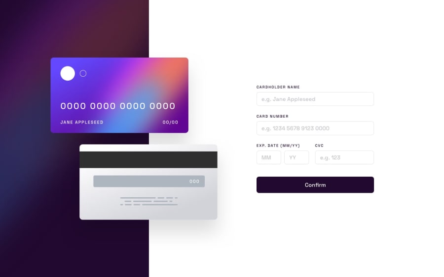
Responsive component page done with grid, flex, space system, variable
@alexsanderBDS
Design comparison
SolutionDesign
Solution retrospective
this took me a while to write the js part cause I wanted a clear code and I could refactor to a better solution than the last one :)
Community feedback
- @sulemaan7070Posted over 1 year ago
hey Alexsander Batista Dos Santos😄, great job regarding both the Styling, as well as the functionality the only thing that your site seems missing, is
when the user enters the valid data the data should be displayed on both card imagesonce again great solution, happy coding👍🏻💯✅
Marked as helpful2@alexsanderBDSPosted over 1 year ago@sulemaan7070 ohh true 😮 I forgot about this, thanks to notice that 😅
2
Please log in to post a comment
Log in with GitHubJoin our Discord community
Join thousands of Frontend Mentor community members taking the challenges, sharing resources, helping each other, and chatting about all things front-end!
Join our Discord
