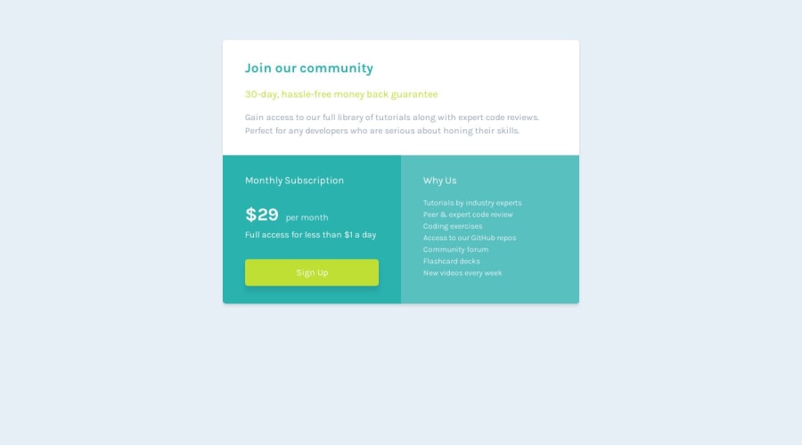
Design comparison
Solution retrospective
I chose to use CSS Flex for this challenge. This allowed for the content to shape the layout instead of me bending backwards to make the content fit into the Grid cells.
I learned a ton about hsl colors vs hsla colors as this challenge has some really subtle box shadowing on the button and on the component itself. It also has a lighter colored cyan card that is simply the cyan color given in the style guide but with more transparency hence using hsla (where the a variable controls transparency). This was a good lesson for me as I have stuck to using hex codes for several years now.
Let me know what you think!
Community feedback
- @0xabdulkhaliqPosted over 1 year ago
Hello there 👋. Congratulations on successfully completing the challenge! 🎉
- I have other recommendations regarding your code that I believe will be of great interest to you.
POINTING CURSOR ↗️:
- Looks like the component's
button
element has not a pointer, this property plays a major-role in terms of both UI & UX
- The
cursor: pointer
CSS property is important for button-like elements because it changes the cursor from the default arrow to a pointer when hovering over the element. This provides a visual cue to the user that the element is clickable and encourages interaction.
- In terms of UI/UX, using
cursor: pointer
helps to improve the usability of the interface by making it easier for users to identify interactive elements. It also helps to provide feedback to the user by indicating which elements are clickable and which are not.
- So we want to add this property to the following
button
element and along with that we can addtransition
property to get smooth animatedbutton
.btn-sign-up { cursor: pointer; transition: .4s ease; }
- Now your component's
button
has got the pointer & you learned about this property as well
.
I hope you find this helpful 😄 Above all, the solution you submitted is great !
Happy coding!
Marked as helpful1@amyspencerprojectPosted over 1 year ago@0xAbdulKhalid Thanks for the feedback! Made those changes to my button 😀
0
Please log in to post a comment
Log in with GitHubJoin our Discord community
Join thousands of Frontend Mentor community members taking the challenges, sharing resources, helping each other, and chatting about all things front-end!
Join our Discord