Design comparison
SolutionDesign
Solution retrospective
Hi everybody 👋🏻!
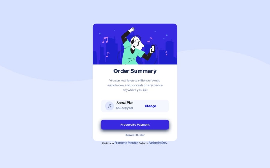
This is my approach of this challenge, i did my best;
I found a little difficult to give to the card like a margin right and left when i turn my screen to mobile dispositive, it only shows on the top and bottom the margin, i try to see if the width has something to do but, it change the position of my component.
i will really gratefully if you can give me a feedback, advices and more!
greeting! 🚀🌱
Community feedback
Please log in to post a comment
Log in with GitHubJoin our Discord community
Join thousands of Frontend Mentor community members taking the challenges, sharing resources, helping each other, and chatting about all things front-end!
Join our Discord
