Submitted 8 months ago
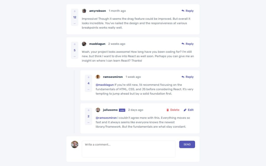
Responsive comments section using css grid and reactjs
#react#vite
@dvdgd
Design comparison
SolutionDesign
Solution retrospective
What are you most proud of, and what would you do differently next time?
I'm proud to have achieve the final result with the key functionalities working as expected. In the next time I would use a css lib to have a code a little bit more organized.
Also I started the project based in the desktop preview using flexbox and when I saw the mobile I noticed that I would need to change to grid display. A gentle reminder to think a little bit more in which one use before start styling.
What specific areas of your project would you like help with?I'd appreciate any feedback!
Community feedback
Please log in to post a comment
Log in with GitHubJoin our Discord community
Join thousands of Frontend Mentor community members taking the challenges, sharing resources, helping each other, and chatting about all things front-end!
Join our Discord
