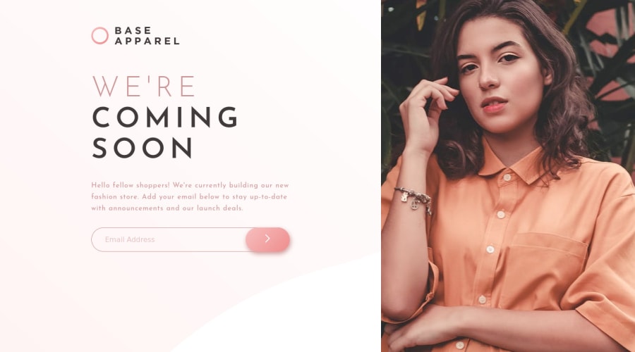
Not Found
Not Found
Not Found
Not Found
Not Found
Not Found
Not Found
Not Found
Not Found
Not Found
Not Found
Not Found
Not Found
Not Found
Not Found
Not Found
Not Found
Not Found
Not Found
Not Found

Submitted

Responsive coming soon page

@MDias04

Desktop design screenshot for the Base Apparel coming soon page coding challenge

This is a solution for...

  • HTML
  • CSS
  • JS
1newbie
View challenge

Design comparison


SolutionDesign

Solution retrospective


I still find it very difficult to position certain elements. And get the project to be completely responsive. I think my media queries could improve.

If anyone has some code reviews please send them my way. I really want to improve.

Community feedback

Angel M 370

@csmurillo

Posted

Hello, if you replace @media screen and (max-width: 375px){} with @media (max-width: 576px) {} your layout will look good in mobile, since currently in some mobile devices your website looks the same as the desktop version. Other than that I think you are good with what you have accomplished for this project. However, I think there is many improvements you can make, and I would suggest when you find time, start this project all over or start another project if you don't want to repeat this project with these suggestion in mind:

Sematic HTML: Try to include all the necessary semantic html, in the webpages you create. Like for this project I would recommend using the header tag, and the main tag. header tag: use it to wrap the logo, and the main tag to wrap the rest of the content in the page.

Mobile First Approach: Create the styles for mobile first, then as you create styles for larger screens like tablets, desktop use media queries to target those devices. Example: tablet use this @media (min-width: 768px) {}, desktop use this @media (min-width: 992px) {} and more. I base my media queries from bootstrap breakpoints. I don't recommend targeting mobile styles with media queries.

Alt In Images: I would suggest reading this article https://blog.hubspot.com/marketing/image-alt-text

PX vs REM: I would suggest reading this https://uxdesign.cc/why-designers-should-move-from-px-to-rem-and-how-to-do-that-in-figma-c0ea23e07a15

Marked as helpful

1

@MDias04

Posted

@csmurillo thank you loads for this amazing review. I am definitely going to improve. 👌🏼

0

Please log in to post a comment

Log in with GitHub
Discord logo

Join our Discord community

Join thousands of Frontend Mentor community members taking the challenges, sharing resources, helping each other, and chatting about all things front-end!

Join our Discord