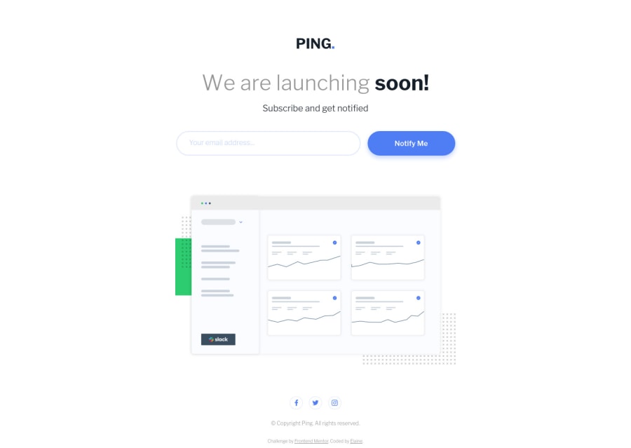
Design comparison
Community feedback
- @mattstuddertPosted over 3 years ago
Excellent work on this project, Elaine! I can see you resolved the initial HTML and accessibility issues, which is great 🙌
I've seen a couple of things after looking at your code:
- You've added
min-width: 375px;to thebody. I'd recommend not doing that, as some devices are narrower than375px, so this is causing a horizontal scrollbar. - I'd recommend always adding the company logo as an
imgtag in the HTML with analtattribute for the company name. For example,alt="Ping"in this instance. This makes the content accessible to screen reader users. - If this were an actual landing page, I'd also say that the "We are launching soon!" text would be the
h1. I see you've added ansr-onlyheading for this, but I thought it's worth mentioning.
You can tell you've paid serious attention to detail on this project. Your solution matches up to the design incredibly well. Keep up the great work! 👍
Marked as helpful1@elaineleungPosted over 3 years ago@mattstuddert Hi Matt, thanks for the comments and suggestions, esp. the note about the
imgtag. I appreciate you taking the time to check out my code and writing up feedback!About the
min-width, that's actually intentional, believe it or not... I can't recall exactly my decision for that, but I think it had to do with the responsive design mode on Firefox's inspector where the scroll bar keeps appearing even when there was nothing to scroll. Either that or something kept messing up with my pixel count, and so I decided to just slap on themin-widthas a bandaid solution since I only need one fixed mobile view for the challenges anyway. It'd be different if the challenges call for true responsiveness! There's a lot of things I do here on FM that I don't normally do for my own projects 😅The
sr-onlyclass for theh1tag is also intentional, just for the sake of screen reader users who might actually chance upon my solutions and for them to know these are challenges/assignments and not actual pages.Thanks again for the encouraging comments!
0@mattstuddertPosted over 3 years ago@elaineleung, no problem! That's a good point about the
h1related to Frontend Mentor challenges and people visiting them with no additional context.I'd recommend having a go at resolving the
min-widthissue. Wherever possible, it's a great idea to treat these challenges like professional projects and build for all screen sizes. It's common to receive mobile and desktop designs, but the developer needs to account for all other possibilities. In a professional setting, you'd have the benefit of being able to sit with the designer and discuss the proposed layout changes.Marked as helpful0 - You've added
Please log in to post a comment
Log in with GitHubJoin our Discord community
Join thousands of Frontend Mentor community members taking the challenges, sharing resources, helping each other, and chatting about all things front-end!
Join our Discord
