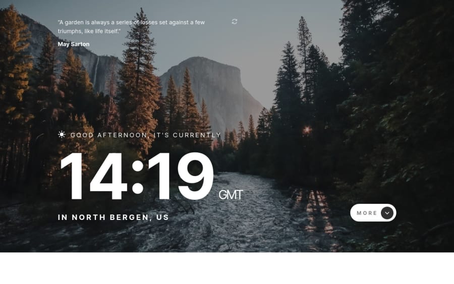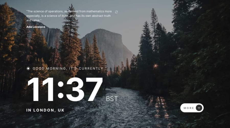
Responsive Clock App - HTML5, Sass and vanilla JS with APIs
Design comparison
Solution retrospective
Tried a live clock, don't hesitate to tell if it's buggy or if the time doesn't match where you are (I got the French time here, which is right of course but there's no "zero risk"...). Thank you ;)
Community feedback
- @A-amonPosted over 3 years ago
Hello! Great work~ The responsiveness looks great. And the overlay is a nice touch added to the design.
I have a few suggestions
-
The alt text for .greeting is rather generic/vague as it describes both sun & moon icon. I don't think it's important enough to be mentioned to user via screen reader (Considering you have already greeted Good Morning, etc. right after it). So you could either leave the alt empty, aria-hide it or use CSS before selector to display it.
-
Use button tag for .reload. This will let users know it's a button on screen reader.
-
Instead of having an extra .background-filter for the overlay, you could use before/after selector.
-
I think you could use checkbox for More button and style it accordingly. This way, you can show/hide "More" & "Less" text using CSS :checked selector. (Don't take my word for this though)
-
About JS, the code looks clean and neat. For the adding/removing of one or two class(es), you can consider using toggle method. This will reduce four lines of code to one line (Probably!).
-
Thanks for reading till here! Since you have already toggled between .day_background and .nighttime_background on body element, I think you could do the rest of the styling using CSS alone without adding/remove classes from its children e.g. greetingIcon, backgroundFilter, etc.
-
If you do both suggestion no.1 (use before selector for icon) and no.6, you can avoid setting the image src directly on JS, and instead, you could just switch the background image in CSS.
Marked as helpful1 -
- @JeanMiesesPosted over 3 years ago
Hey on my desktop, the background is not covering the entire page. It is about 50% width and height as well. Here is an image https://ibb.co/vDKdLmH
It looks fine on mobile.
Marked as helpful1@charlottesaidiPosted over 3 years ago@JeanMieses Thank you for the feedback 👍 I think I forgot the background size property (I was on laptop, coudn't see if anything was out of place) I'll take a look at that. Thanks again 👌
1
Please log in to post a comment
Log in with GitHubJoin our Discord community
Join thousands of Frontend Mentor community members taking the challenges, sharing resources, helping each other, and chatting about all things front-end!
Join our Discord
