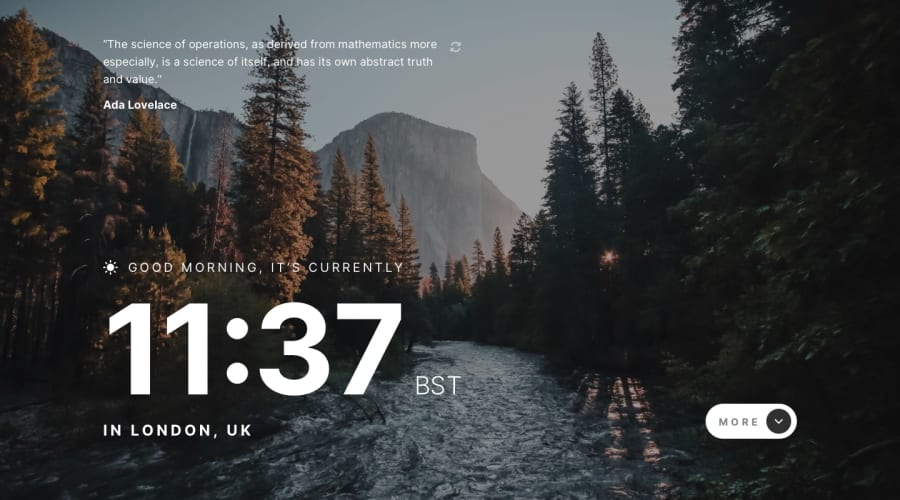
Design comparison
Solution retrospective
I'm happy to have reached the end of this challenge. At this stage, I don't know what I would have done differently.
What challenges did you encounter, and how did you overcome them?I had difficulty positioning the elements because of the extra content that appears when you click on the "more" button. Initially, I'd coded my entire layout without taking this into account and then, when I finally integrated it, I realised that I couldn't use padding on the parent container and that I'd (perhaps) have to use margins. At this stage, I'm not sure that's the best way to do it. I'm a bit disappointed because (and I don't know what my learner peers think), but sometimes I feel confident in HTML and CSS and the next moment I can't get the result I want properly and I'm doubting again.
What specific areas of your project would you like help with?If you've worked on this project differently for the positioning of the elements, I'd be happy to know how and why. Thanks in advance!
Community feedback
- @Sylvester009Posted 7 months ago
I am wowed
0
Please log in to post a comment
Log in with GitHubJoin our Discord community
Join thousands of Frontend Mentor community members taking the challenges, sharing resources, helping each other, and chatting about all things front-end!
Join our Discord
