
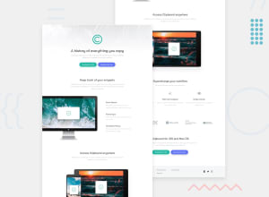
Responsive clipboard page using grid, flexbox and media queries

Design comparison

Solution retrospective
Hello Guys,
I had a lot of fun with this one. Frontend Mentor does not provide designs for tablets so I used a max-width of 1000px for the media query. I found this to be the best design for tablets, landscape, and smartphone screens.
However, I am still struggling to find the most suitable method for SVG styling. The logo, for instance, is a different size in the header and footer. I thought I could use CSS to change the viewBox and viewport heights and widths, but I was unable to do so. I had to place the footer SVG inline in HTML and style it there.
I also was unable to change the fill property of SVG social icons on hover or active states. I know I could have used Font Awesome to do this instead, but I wanted to challenge myself.
I would appreciate a better method than the one I have used for styling SVGs in CSS and HTML. I wish to make the code as optimized as possible.
Thank you.
Community feedback
- @NorwyxPosted 10 months ago
Make sure everything is centered.
0@obinysolPosted 10 months ago@Norwyx On which section specifically? I believe I have centered everything
0@NorwyxPosted 10 months ago@obinysol Supercharge your workflow and company logos. Otherwise, looks great.
0


Please log in to post a comment
Log in with GitHub
Join our Discord community
Join thousands of Frontend Mentor community members taking the challenges, sharing resources, helping each other, and chatting about all things front-end!
Join our Discord