
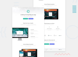
Responsive clipboard landing page using tailwindcss

Design comparison

Solution retrospective
arranging the page into sections, which is simpler and faster to do
What challenges did you encounter, and how did you overcome them?positioning the contents of the social media icons
What specific areas of your project would you like help with?is it a good idea to use the directives when working with tailwind css
Community feedback
- @OmprakashRPosted 10 months ago
Hi,
Congratulations!! I hope you are doing well.
I have some suggestions for your Tailwind CSS work:
There is no need to add custom classes like .button-container, .section-content, and others to combine CSS properties into one single class. Tailwind already provides a rich playground for responsive breakpoints. There are five default breakpoints, inspired by common device resolutions: Example: <div class="w-16 md:w-32 lg:w-48"></div>
For more details, refer to the Tailwind CSS documentation on breakpoints.
Using Tailwind's utility classes, we can achieve all possible combinations without the need for custom classes.
I hope this helps!
Thank you!
0

Please log in to post a comment
Log in with GitHub
Join our Discord community
Join thousands of Frontend Mentor community members taking the challenges, sharing resources, helping each other, and chatting about all things front-end!
Join our Discord