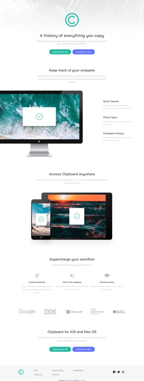
Responsive clipboard landing page using desktop first approach
Design comparison
Solution retrospective
How can I improve my media queries and any other feedback on which I can improve?
Community feedback
- @RioCantrePosted almost 3 years ago
Hello there! Good job in completing this project. Viewing at your solution, I would like to recommend the following for you...
- It's advisable to use one
footer
tag for the whole content. Refactor this part into...
<footer class="footer"> <div class="footer-info"> .... </div> <p class="attribution"> ..... </p> </footer>
- Include description with the
alt
inimg
tags - Add the hover state of the
button
, links and icons. For the buttons, addbackground: hsla(171, 52%, 58%, 1);
in.btn-ios
andbackground: hsla(232, 100%, 77%, 1);
in.btn-mac
. The hover state in thefooter
content should have thebackground: hsla(171, 52%, 58%, 1);
in the icons and links. - Refactor the footer list, wrap individually the items in
contact-part
witha
tags - Increase the breakpoints with
max-width: 768px
intomax-width: 902px
. The buttons and images are staking in this part. - Remove the background image in the
header
and media query, placed it on thebody
rule set instead. Addbackground-size: contain;
.
Above all, you did good with implementing the design. Hope this helps and Keep it going!
Marked as helpful2@sanketcharanpahadiPosted almost 3 years ago@RioCantre Thanks for your help and feedback, Thank You.
1 - It's advisable to use one
- @grace-snowPosted almost 3 years ago
I advise against sizing down your base font size. There is no reason you need 1 rem to equal 10px, and by doing this you are introducing huge potential accessibility problems for some users. Let the defaults remain.
Marked as helpful1@sanketcharanpahadiPosted almost 3 years ago@grace-snow Thanks for pointing out the mistakes , I will never do them again.
0 - @grace-snowPosted almost 3 years ago
Hi
You need to look up how and when to write img alt text. The most important content on the whole page is the logo but you've hidden that with blank alt. Yet you've written unreadable text for other images that aren't so important. And all the logos (again, meaningful content) are hidden again.
Marked as helpful1
Please log in to post a comment
Log in with GitHubJoin our Discord community
Join thousands of Frontend Mentor community members taking the challenges, sharing resources, helping each other, and chatting about all things front-end!
Join our Discord