Design comparison
Community feedback
- @RazvanTSGPosted over 1 year ago
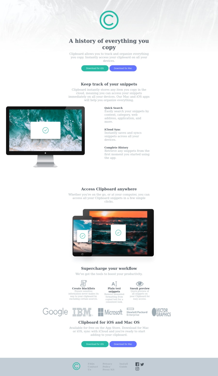
Great submission! I have some advice for you: -add more margin between the elements. you can write something like .element{ margin:100px 0; } -Make the buttons glow when you point over them. you can do that by writing: .button:hover{ background-color:(whichever one you want); } -in the comptext, you should have set justify-content to center, so as not to get the computer to the edge of the screen -you can make the text in the navbar a different color while hovered on with the same principle as making a button a different color, as I showed you above -I would also suggest you to add padding and margin to every element, to make it look better The mobile design is really impressive, although adding more margin to it would make it even better. If you have any questions, feel free to ask me and I will be happy to answer.
Marked as helpful0
Please log in to post a comment
Log in with GitHubJoin our Discord community
Join thousands of Frontend Mentor community members taking the challenges, sharing resources, helping each other, and chatting about all things front-end!
Join our Discord
