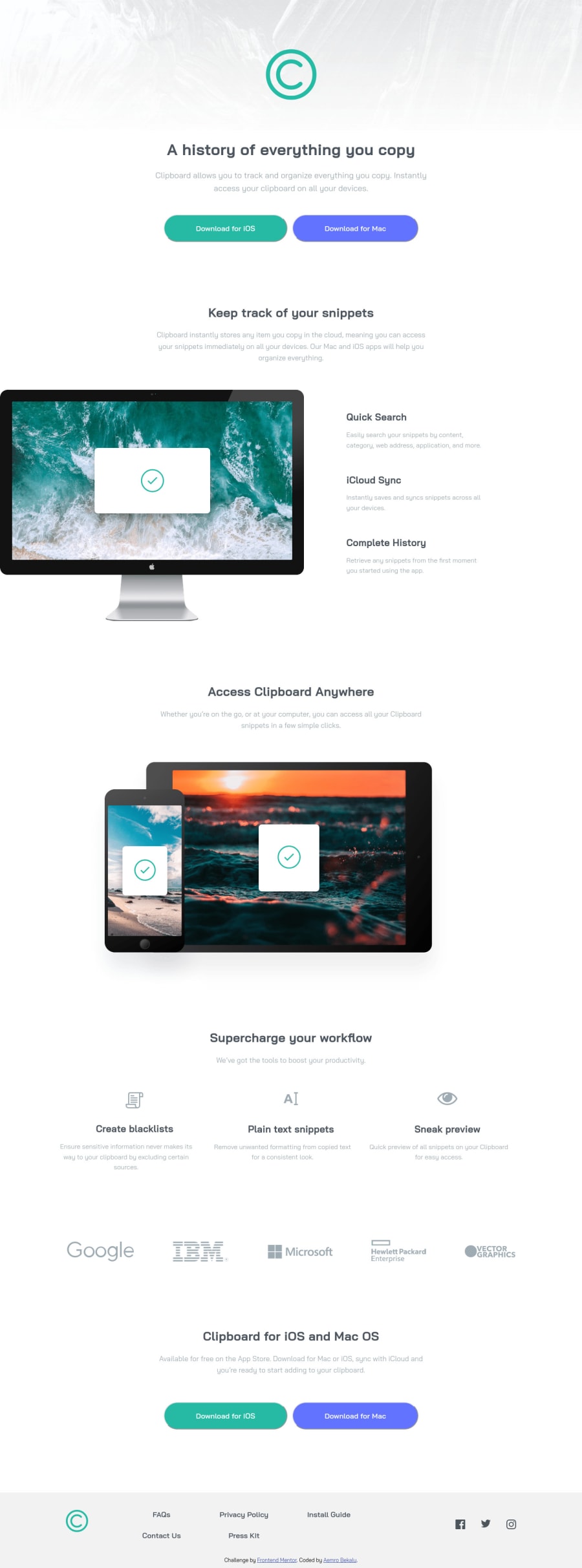
responsive clipboard landing page by css flexbox and css grid
Design comparison
Solution retrospective
Any feedback on how can I improve my solution are welcomed !
Community feedback
- @isprutfromuaPosted over 2 years ago
Hi there! Congratulations on completing the challenge.
I have a few recommendation about the solution:
✅ use font-display: swap
@font-face {
  font-family: "baijamjuree-semi-bold";
  /*600*/
  src: url(./font-baijamjuree/BaiJamjuree-SemiBold.ttf);
}

@font-face {
  font-family: "baijamjuree-regular";
  src: url(./font-baijamjuree/BaiJamjuree-Regular.ttf);
  /*400*/
}
✅ avoid magic numbers and tag styling . When you add CSS directly on tags, your markup can’t change. Your style is tightly coupled to your DOM, and any change increases the risk of breaking things.
max-width: 585.333px;
margin: 0 64px 23px;
footer-item a
footer .logo
✅ don't use !Important. It's first call that your styles will not be able to grow in the future without pain
margin-top: 0 !important;I hope my feedback will be helpful. You can mark it as useful if so 👍 it is not difficult for you, but I understand that my efforts have been appreciated
Good luck and fun coding 🤝⌨️
1@aemrobePosted over 2 years ago@isprutfromua what should I change with If I remove the tag-styling and magic numbers.
0
Please log in to post a comment
Log in with GitHubJoin our Discord community
Join thousands of Frontend Mentor community members taking the challenges, sharing resources, helping each other, and chatting about all things front-end!
Join our Discord
