Design comparison
SolutionDesign
Solution retrospective
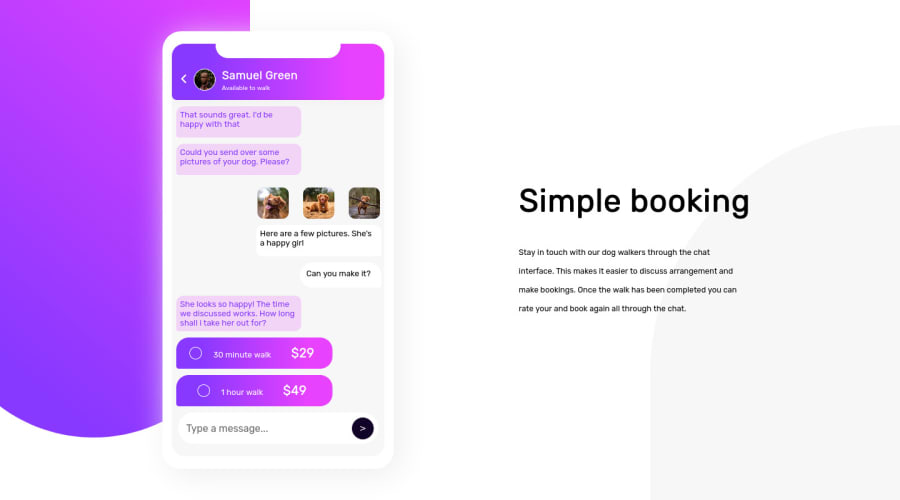
The problem i had with this project was the positioning, not on the chat app but the big backgrounds, most especially the one at the bottom, i tried to position to the bottom right using "position:absolute;" "bottom: -500px;", "right: -200px;", instead of pushing it down and right the viewport, it just increased the size of the viewport i.e increasing the height and the width.i'd really appreciate it if you can tell me what i should have done
Community feedback
Please log in to post a comment
Log in with GitHubJoin our Discord community
Join thousands of Frontend Mentor community members taking the challenges, sharing resources, helping each other, and chatting about all things front-end!
Join our Discord
