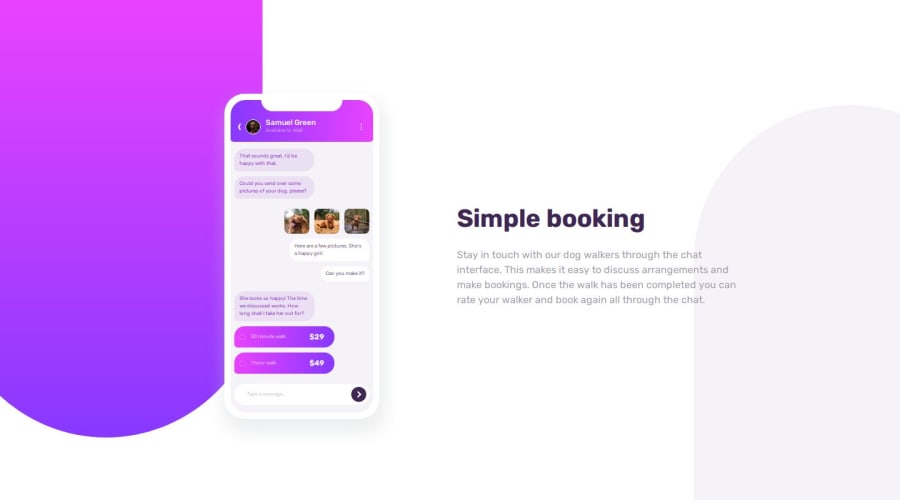
Responsive Chat App CSS Illustration (HTML AND CSS ONLY)


Design comparison

Solution retrospective
This is by far the most frustrating part of this project for me. Why does the overflow keep showing ing developer mode when the body::before doesn't show any overflow?
body::after {
  bottom: 0;
  right: -170px;
  background-color: hsl(var(--violet-lg));
  border-radius: 250px 250px 0 0;
}
Had to give absolute values for dimensions on the mobile which probably isn't the best idea for responsiveness but it felt necessary especially as the width of the device was same for both tab and mobile display.
As seen above, getting the background was probably the most difficult part for me, getting it to be responsive was even more annoying.
Used only one breakpoint but it didn't look bad at all, hopefully that sticks.
What challenges did you encounter, and how did you overcome them?Accessibility and Responsiveness (esp. working with clamps)
What specific areas of your project would you like help with?Help give constructive criticism
Community feedback
Please log in to post a comment
Log in with GitHub
Join our Discord community
Join thousands of Frontend Mentor community members taking the challenges, sharing resources, helping each other, and chatting about all things front-end!
Join our Discord