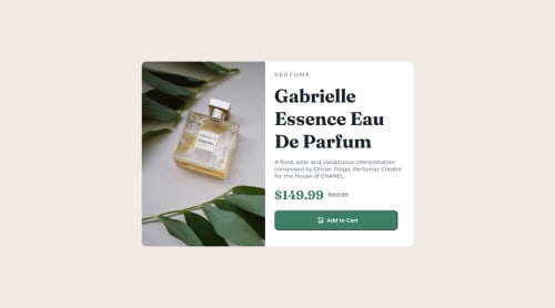
Submitted over 1 year agoA solution to the Product preview card component challenge
Responsive CHANEL Product Preview
@ysstudio22

Solution retrospective
What are you most proud of, and what would you do differently next time?
Applying different images for different view ports. I had to do a bit of research but it was worth it.
What challenges did you encounter, and how did you overcome them?The biggest challenge was eyeballing the card sizes for the mobile and desktop view. I went back and forth between the design, but the previous challenges provided the foundation for this current challenge.
What specific areas of your project would you like help with?I might try to tweak the spacing between the svg and "Add to Cart" text inside the button.
Code
Loading...
Please log in to post a comment
Log in with GitHubCommunity feedback
No feedback yet. Be the first to give feedback on Yoshi's solution.
Join our Discord community
Join thousands of Frontend Mentor community members taking the challenges, sharing resources, helping each other, and chatting about all things front-end!
Join our Discord