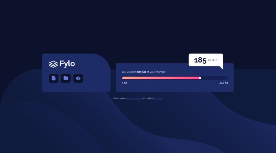
Design comparison
Solution retrospective
Here's my third challenge guys ! i've tried to implement all the good practices i've learned. tried to make my code cleaner. Do you know a way to check your css to prevent from useless lines of codes (like specificity contradiction and all ) ? I've made my first animation as well. And learned many little things here and there.
Would be happy from your returns guys !
See ya
Community feedback
- @NaveenGumastePosted over 2 years ago
Hay ! Nico Pom Good Job on challenge
These below mentioned tricks will help you remove any Accessibility Issues
-> Add Main tag after body
<main class="container"></main>-> Always use h1 first and then h2, h3 and so on
-> Learn more on accessibility issues
If this comment helps you then pls mark it as helpful!
Have a good day and keep coding 👍!
Marked as helpful0 - @EmmanuelHexerPosted over 2 years ago
Good job overall man. Nice work
- One tip i can give you is to always add h1- h6 elements for your headers instead of divs.
Marked as helpful0
Please log in to post a comment
Log in with GitHubJoin our Discord community
Join thousands of Frontend Mentor community members taking the challenges, sharing resources, helping each other, and chatting about all things front-end!
Join our Discord
