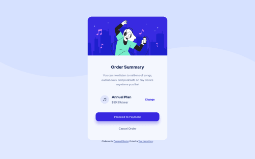
Responsive cards view make with Flexbox
Design comparison
Solution retrospective
Hi there! I am trying to take my best possible performance of these exercises. Please if you have suggestions, they are welcome! I need to improve .. thank you very much!
Community feedback
- @pleasantvikPosted almost 3 years ago
Great work @migham, there are still some improvement you can do in the CSS. You didnt do the hover state of your payement and cancel order. in the link also you didnt style the link and visited pseudo class for link. But generally, its a good design
Marked as helpful1@mighamPosted almost 3 years ago@pleasantvik thank you very much for taking the time to send me your feedback! I already fixed the hover as you suggested! Thank you. As for the 'visited' state, I wasn't sure if it would be necessary or not, given that each card would be a new component ..
0 - @pikapikamartPosted almost 3 years ago
Hey, awesome work on this one. The overall layout looks nice I think. Just needed a bit of
padding
to the top and bottom of thebody
so that the layout won't be touching the ceiling and flooring of the screen.Adedayo already gave a feedback on this one, just going to add some suggestions as well:
- Avoid using
height: 100vh
on a large container like thebody
as this makes the element's height capped based on the viewport/screen's height. Instead usemin-height: 100vh
so that the element will expand if it needs to. - For this, you could use a markup that looks like:
<main /> # main-content <footer /> # attribution
This way, all contents are living inside their respective landmark elements.
- The image on the card, the vector/illustration is only acting as decorative image. Decorative images should be hidden for screen-reader at all times by using
alt=""
andaria-hidden="true"
to theimg
tag or onlyaria-hidden="true"
if you are usingsvg
instead ofimg
tag. - Only use descriptive
alt
on images that are meaningful and adds content to the site otherwise hide the image for screen-reader users. - For this, since you are using
h2
for theorder summary
text and not anh1
, then theh1
would be used as a screen-reader onlyh1
. Since as you remember, a singleh1
should be present on the site. Meaning it will be hidden visually but present for screen-reader users. On this, theh1
would have likesr-only
class and the text-content should describe what is the main-content is all about and will be placed inside themain
tag as the first text-element on it. Have a look at Vanza's solution on this same challenge. Inspect the layout and see the usage of theh1
as well the stylings applied to it. - The music-icon as well is only acting as decorative, hide it using the method I mentioned above.
- When wrapping up a text-content, make sure that it is inside a meaningful element like
p
tag or heading tag and not using likediv, span
to wrap the text. Look at the text after theannual plan
- The
proceed to payment
andcancel order
are interactive components and should be using interactive elements like abutton
or ana
tag.
Aside from those, great job again on this one.
1 - Avoid using
Please log in to post a comment
Log in with GitHubJoin our Discord community
Join thousands of Frontend Mentor community members taking the challenges, sharing resources, helping each other, and chatting about all things front-end!
Join our Discord