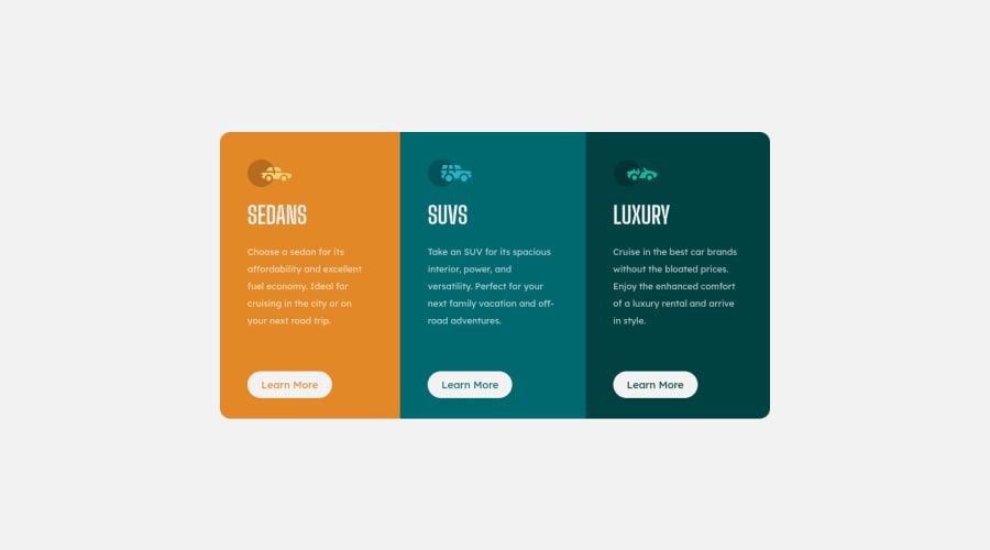
Responsive Cards Using HTML, SCSS, FLEXBOX, CSS GRID (WEB ACCESSIBLE)
Design comparison
Solution retrospective
I wanted to try out some new CSS tricks with this challenge.
Check the way I converted my pixels to rem using a function.
Check my accessibility also!
Thank you!
Community feedback
- @grace-snowPosted over 3 years ago
Really nice work here!
Personally, I don't think those icons are meaningful, so would aria hide them but that's just my preference.
And those links shouldn't be role button.
The rest is great!
1@folathecoderPosted over 3 years ago@grace-snow Hi Grace! 👍
Do you mind telling me when and when not to use roles, because I thought buttons need to be indicated. Why shouldn't the links be role: button?
Can you also tell me when not to add alt text on images?
Thank you!
0@grace-snowPosted over 3 years ago@folathecoder role button is saying "I want these to have button semantics and be interacted with like a button" - it's saying they are triggering actions not being navigation.
As a general rule it is rare to want to change the role of a html element, as if you needed to, you'd just use that element in html in the first place.
With the images, you want them to have alt descriptions if they need to be listed and announced as meaningful content. Are they adding to the meaning of the document, or are they purely decorative? I think these images are decorative - the content's meaning would not be altered by the images being there or not, they're not bringing any real value. So I would hide them.
1@folathecoderPosted over 3 years ago@grace-snow Thank you Grace, you have really been a blessing in my journey as a Dev. I appreciate your effort! 👍
0
Please log in to post a comment
Log in with GitHubJoin our Discord community
Join thousands of Frontend Mentor community members taking the challenges, sharing resources, helping each other, and chatting about all things front-end!
Join our Discord
