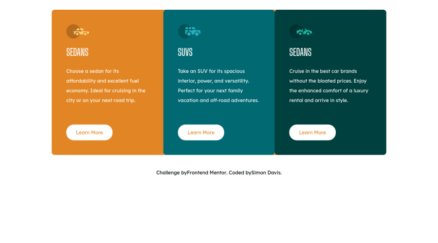
Design comparison
Solution retrospective
When hovering over the Learn More button, I had to use a box-shadow instead of border to make sure the button doesn't have a position offset and sometimes it grows the card's height. Not sure if there is a way to use border for this part of the code without it acting funky: .card__cta:hover { background: none; box-shadow: 0 0 0 0.2rem var(--white); color: var(--white); }
I tried using box-sizing: border box but that didn't do the trick. Anyway if there is anything that could be better let me know. :)
Community feedback
- @palgrammingPosted over 3 years ago
remove the padding from the button and set a fixed width and height then when you hover them they will not change size and just show the outline. some might say not to use fixed pixels but it works it allows for hover without the button size changing
0
Please log in to post a comment
Log in with GitHubJoin our Discord community
Join thousands of Frontend Mentor community members taking the challenges, sharing resources, helping each other, and chatting about all things front-end!
Join our Discord
