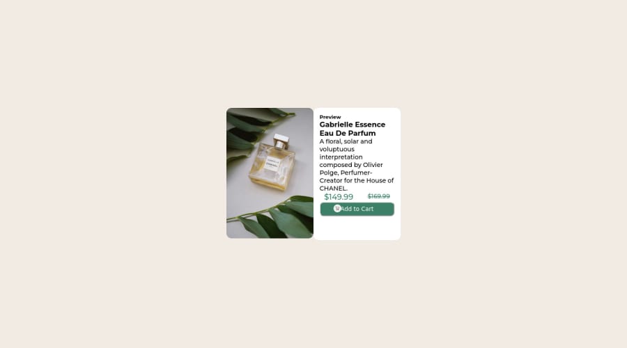


Design comparison

Community feedback
- @correlucasPosted about 2 years ago
👾Hello Animesh Anand, Congratulations on completing this challenge!
I saw that you’ve used
flexboxto place the content and create the layout.I think the best way to build this component with two columns is by using
GRID LAYOUTsince it is simpler to manage the columns and then create the media query for mobile. Here’s the steps to create it withgridcreate the main block to hold all the content (you can use<main>to wrap), set itswidthasmax-width: 900px(it's the container size) anddisplay: grid/grid-template-column: 1fr 1fr(this means that your component will have two columns with 50% of the container width each thats 450px). To manage the column with the text use flexbox andgapto give it the spacing between the texts or usepadding-bottomto separate them.Then to create the mobile version, all you need to do is to change the container flow vertically with
grid-template-column: 1fr.✌️ I hope this helps you and happy coding!
0

Please log in to post a comment
Log in with GitHub
Join our Discord community
Join thousands of Frontend Mentor community members taking the challenges, sharing resources, helping each other, and chatting about all things front-end!
Join our Discord