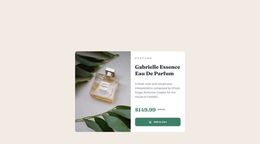
Design comparison
Solution retrospective
Hi! I would like feedback on my css code and if you have suggestions to improve the code. Thanks!
Community feedback
- @suhaybjirdePosted about 2 years ago
well done 👏 but your image is too big i'm going to check you code now i'll let you know where you did it wrong if you need more help let me know i might help you fell free to use my code as a reference i already did this challenge
Marked as helpful0 - @Emvil-gitPosted about 2 years ago
Hello, I've noticed that the body itself is quite long, you can keep it within the viewport by adding the following CSS properties to the body tag:
height: 100vh; width: 100vw; display: grid; place-content: center; <----------- the last two lines centers the card component
Also, you can also make the image responsive using the <picture> and <source> tags:
<picture> <source media="(min-width: 1024px)" srcset="images/image-product-desktop.jpg"> <img src="images/image-product-mobile.jpg" alt="default image"> </picture>**I used (min-width: 1024px) because I was trynna do mobile-first, otherwise you can use (max-width: [mobile screen size in px])
That's all I could offer regarding feedback. Great work, though! and I wish you luck in your web development journey! 💪💪💪
Marked as helpful0@CariCosta90Posted about 2 years ago@Emvil-git Thanks! very useful and helpful, I will try to apply the changes you suggested.
1 - @partharora100Posted about 2 years ago
Your code seems fine, I don't have much to say but one thing I can suggest is to use class names for the different elements and not prefer class drilling it will help you while creating big projects. In this case, this is not a problem but will help you in the future. Great work!!
Marked as helpful0
Please log in to post a comment
Log in with GitHubJoin our Discord community
Join thousands of Frontend Mentor community members taking the challenges, sharing resources, helping each other, and chatting about all things front-end!
Join our Discord
