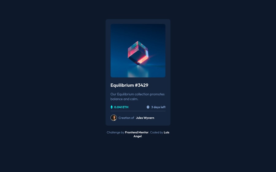
responsive card, with hatml and native css with bem methodology
Design comparison
Solution retrospective
I did not find a way that the icon-view would not affect the opacity, I thought of separating it into two different containers which did work but it looks cooler that way, any comment is appreciated.
Community feedback
- @kenreibmanPosted over 2 years ago
Hi @LuisJimenez19 ! Great work on this.
There are a few ways you could approach this issue. I'm going to give you my take on it. Hopefully you can understand, and it would help!
-
First off, I would change your
card__image--active
into ana
(anchor) tag. -
I would change that into an anchor tag because it makes it more user-friendly to click on the NFT image. It's a little bit of a pain for some users when you have to click on very specific spots of a card/image to open the link. It's better when you just make the whole container click-able and make the actual button (the eye) a decoration, or a "fake button" as I like to call it. The user will still think the eye is a button.
-
You don't need an active class in this situation since you're not using JavaScript. I would remove all the hover states you have right now. I would also remove the opacity and background-color on your card__image--active.
-
Add a
position: relative
to your card__image--active, move your background-image from your card__image div to the card__image--active div and make a pseudo element on that. So it would be:
.card__image--active { ... other styling background-image: url(../images/image-equilibrium.jpg); position: relative; } .card__image--active::after { content: 'url(image)' /* <-- this is your eye image */ position: absolute; top: 50%; left: 50%; transform: translate(-50%, -50%); opacity: 0; visibility: hidden; /* (the top, left, and transform properties centers the eye on the container) */ }
- Then set a hover state on your card__image--active and your card__image--active::after (pseudo element)
.card__image--active:hover { opacity: 0.8; /* this lightens the image */ } .card__image--active:hover::after { visibility: visible; opacity: 1; /* this makes the previously hidden eye icon (opacity: 0) appear when the card__image--active div is on hover by the user and changes it to (opacity: 1) */ }
Basically the logic in this, is that the eye icon is currently hidden indefinitely. Only when the user hover overs the --active container, it will become visible, and at the same time the container behind it has its opacity go down. This works because the pseudo element wont receive the opacity effect and they will work simultaneously.
I hope this helps! I'll be honest, I did not test any of the css when I wrote it. so please get back to me if there are any issues.
Marked as helpful0@LuisJimenez19Posted over 2 years ago@kenreibman I was able to solve it, I only gave the opacity to the background color, and I gave the icon all the opacity so that it could keep its original color, I also changed the div for <a> as you had specified, thanks
0 -
Please log in to post a comment
Log in with GitHubJoin our Discord community
Join thousands of Frontend Mentor community members taking the challenges, sharing resources, helping each other, and chatting about all things front-end!
Join our Discord