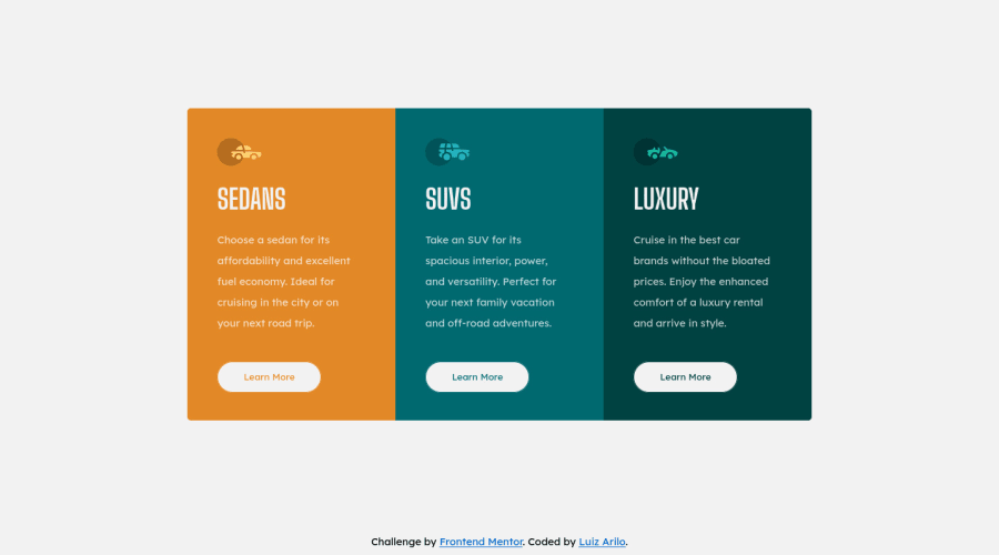
Design comparison
SolutionDesign
Community feedback
- @correlucasPosted over 2 years ago
👾Hello Luiz, congratulations for your new solution!
Your solution is already great, but your component is breaking around
max-width: 840pxto avoid this behavior you should apply the media query a little bit before or give your card more responsivity by creating a media query reducing the text size.Use a bigger value for the rounded corners:
.card__content__sedans {
    border-top-left-radius: 12px;
    border-bottom-left-radius: 12px;
}
👋 I hope this helps you and happy coding!
0
Please log in to post a comment
Log in with GitHubJoin our Discord community
Join thousands of Frontend Mentor community members taking the challenges, sharing resources, helping each other, and chatting about all things front-end!
Join our Discord
