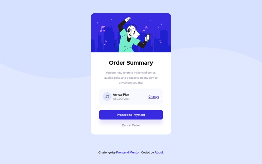
Design comparison
Solution retrospective
it's been a while solving challenges and coding.
Community feedback
- @vinaypuppalPosted over 3 years ago
Hey, looks good. Take a look below 370px,
- The card is touching the edges adding some padding around the card should fix it.
- The attribution text is overlapping with card
Marked as helpful1@abdulrahman-rwimPosted over 3 years ago@vinaypuppal thanks for the note bro, maybe this is happening because of the container height, I looked at the design on my phone and everything is great but in the browser, it looks weird, can you help me avoid this problem
0@vinaypuppalPosted over 3 years ago@abdulrahman-rwim Sure. Maybe remove container styles and move flexbox styles to body like
body {
    display: flex;
    flex-direction: column;
    justify-content: center;
    align-items: center;
    min-height: 100vh;
}
.container {
/* remove-your-existing-styles */
}
If you want your
attributionblock to be at bottom of the screen then you can be.containertake the rest of the screen height ignoring attribution block height like shown below.container { display: flex; min-height: calc(100vh - 100px); /* Here we setting container height take the rest of the screen height ignoring attribution block height */ align-items: center; justify-content: center; }Marked as helpful1 - @FluffyKasPosted over 3 years ago
Hey, it's a great looking solution! Your alts aren't functional though. Here's this great article about the topic that I'm sure you'll find useful: (https://axesslab.com/alt-texts/)
Marked as helpful1@abdulrahman-rwimPosted over 3 years ago@FluffyKas thanks for the note, and the article is amazing, I fixed the alt text
0
Please log in to post a comment
Log in with GitHubJoin our Discord community
Join thousands of Frontend Mentor community members taking the challenges, sharing resources, helping each other, and chatting about all things front-end!
Join our Discord
