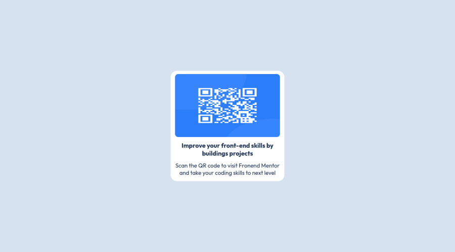
Design comparison
Solution retrospective
I think it was a fairly simple project, made with SCSS and React that facilitates modularization
I appreciate any comments or suggestions for improvement
Community feedback
- @MelvinAguilarPosted over 1 year ago
Hello there 👋. Good job on completing the challenge !
You have used many media queries, even in this challenge it is not necessary to have a media query. I can give you some tips to create the component responsive without using a media query.
- The component is a bit small. Note: all values will adjust to the size of your component.
- Setting the width of the component with a percentage or a viewport unit will behave strangely on mobile devices or large screens. You should use a max-width of
204pxto make sure that the component will have a maximum width of204pxon any device, also remove thewidthproperty with a vw value. Additionally, addpaddingto avoid border touching the image.
.card { max-width: 204px; padding: 12px; background-color: #fff; border-radius: 20px; /* NOTE: Later you can remove all these media queries.*/ @include responsive($Small) { // height: 52vh; // width: 83vw; } @include responsive($Mobile) { // height: 51vh; // width: 75vw; } . . . }- Update the image selector to make responsive images and remove all the media query:
.image {
    max-width: 100%;
    /* NOTE:  All of this is unnecessary, you can remove it so that your image doesn't shrink like in the screenshot.*/
    @include responsive($Small) {
      // margin: 1.5vh 5vw;
      // height: 30vh;
      // width: 73.5vw;
    }
    @include responsive($Mobile) {
      // margin: 1.5vh 4.5vw;
      // height: 30vh;
      // width: 66.5vw;
    }
}

/* NOTE:  All of this is unnecessary, you can remove it so that your image doesn't shrink like in the screenshot.*/
.qrImage {
    // margin: 0;
    // padding: 0;
    @include responsive($Small) {
      // height: 34vh;
    }
    @include responsive($Mobile) {
      // height: 34vh;
    }
}
I hope you find it useful! 😄 Above all, the solution you submitted is great!
Happy coding!
2 - @Josemario17Posted over 1 year ago
Good job, for this solution my suggestion is the following: increase the height of the container or decrease its width, to make it as square as possible, I hope I helped.
enjoy the code
0
Please log in to post a comment
Log in with GitHubJoin our Discord community
Join thousands of Frontend Mentor community members taking the challenges, sharing resources, helping each other, and chatting about all things front-end!
Join our Discord
