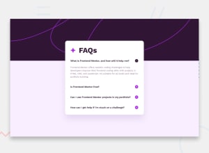
Design comparison
SolutionDesign
Solution retrospective
Caso alguém tenha uma dica pode me mandar, por favor.
In case somebady has some tips to give me, i'd happy to listen.
Community feedback
- @BlackpachamamePosted 11 months ago
Greetings! you have done a great job 😎
📌 Some accessibility and semantics recommendations for your HTML
- To improve the semantics of your HTML, you can change your
<div class="container">to a<main class="container">
📌 Some suggestions
- Instead of using
positionto center your content in the center of the screen, you can use theflexboxorgridproperties in thebody. You will no longer need thedivwith classBackgroundBody:
body {
    background-color: hsl(275, 100%, 97%);
    background-image: url(./assets/images/background-pattern-desktop.svg);
    background-repeat: no-repeat;
    min-height: 100vh;
    display: grid;
    place-content: center;
}

.container {
    border-radius: 20px;
    background-color: white;
    /* margin: 15% 35%; There's no need */
    padding: 25px;
    text-align: justify;
    /* position: absolute; There's no need */
}
Marked as helpful0@TigoPPosted 10 months ago@Blackpachamame im so greatufull for yor help!! People like you that makes me believe more and more in human being.
You helped me to improve my codes for the rest of my life and everytime I use it, I'll remember your help with gratutude!
1 - To improve the semantics of your HTML, you can change your
Please log in to post a comment
Log in with GitHubJoin our Discord community
Join thousands of Frontend Mentor community members taking the challenges, sharing resources, helping each other, and chatting about all things front-end!
Join our Discord
