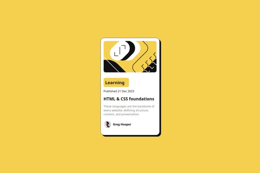
Design comparison
Solution retrospective
The thing that im more proud is the fact that i had practice with box-shadow: and the time that i spent doing the page was very little comparing with the others
The principal challenges was:
- the shadow that i had to put exactly, and i overcome it learning a book about CSS
- Put the footer childs one next to each other
I want some explanations about responsive design, to make my page responsive i had to put several @media(min-width) {} for all the screens and i don't know if it's the optimal solution
Community feedback
- @grace-snowPosted 12 months ago
Hi
This doesn't need any media queries at all! The card should only have one max width in rem and no widths or heights anywhere except that avatar image. That's a really important concept to understand. Max width says "let this grow up to this point and no wider; but if there isn't room for that let it go narrower".
The other thing I notice straight away is the text sizes in your solution look way off the original design. Try to get this much closer.
Marked as helpful1@grace-snowPosted 12 months agoLooking at the code I see more problems actually
- This is a single card component it is not a full Web page. The card should be a div inside main, and the attribution should be a footer. No other landmarks are required and there definitely should be none inside the card component itself.
- Decide if the card image is important content or not. If it is, it needs a much better written description. There is a good post in the resources channel on discord about how to write good alt text that's worth reading.
- The tags/topic on the card (learning) is just a paragraph not a heading.
- When building single components like this it's important to think about the context of where they will be used. This card would never be a page title so you should know it cannot have a h1 within it. The blog title would need to be a h2.
- How would someone access this blog? You've missed the anchor link out that should sit within the heading, wrapping the name of the blog. Always take note when you see a hover style in a design — that means an interactive element is essential.
- It's better for performance to link fonts in the html head instead of css imports.
- Get into the habit now of including a full modern css reset at the start of the styles in every project. Andy Bell or Josh Comeau both have good ones you can look up and use.
- Never use width 100vw. All that will ever do is cause horizontal scroll bugs because viewport units don't account for scrollbars or device notches. So 100vw actually means "full width plus the width of the scrollbar". The body is always full width anyway so you don't need a width property at all.
- Never limit the height of elements that contain text, including the body. Min height 100vh is fine to use height 100vh is not.
- Font size must never ever be in px. This is extremely important.
- Remove all.media queries as stated above. In future challenges where you may need them, remember that media queries must always be defined in rem or em not px.
- The card must not have a width or height, only a single max width in rem. Let the browser do it's job and decide what height is needed based on the content.
- Nothing inside the card should have an explicit height or width except the avatar image. Remove any widths in px.
- To make the whole card clickable, the card will need to be position relative. Then the blog title anchor (link) will need a pseudo element absolutely positioned and sized to cover the whole card. That will make the whole thing clickable.
- Consider using the time element inside the published date paragraph.
Marked as helpful1
Please log in to post a comment
Log in with GitHubJoin our Discord community
Join thousands of Frontend Mentor community members taking the challenges, sharing resources, helping each other, and chatting about all things front-end!
Join our Discord
