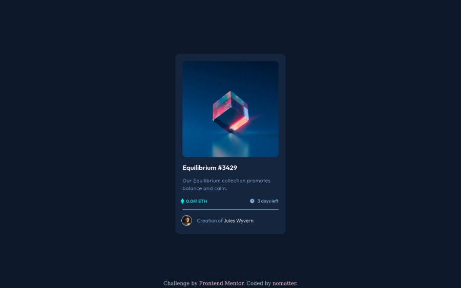
Design comparison
Solution retrospective
Finding <main> width for a responsive card, and the z-index for the image hover effect was a bit hard. I am unsure if the transform: translate() is good for responsive layouts or not.
Community feedback
- @PhoenixDev22Posted over 2 years ago
Hello nomatter,
Congratulation on completing this challenge. I have some suggestions regarding your solution if you don't mind:
- Since there's a :hover state on the image and means it's interactive, So there should be an interactive element around it. When you create a component that could be interacted with a user , always remember to include interactive elements like(button, textarea,input, ..) For this imagine what would happen when you click on the image, there are two possible ways:
1: If clicking the image would show a popup where the user can see the full NFT, here you use
<button>.2:If clicking the image would navigate the user to another page to see the NFT, here use
<a>.- Also use
<a>to wrapJules Wyvern and Equilibrium #3429.
- The link wrapping the equilibrium image (
image-equilibrium) should either haveSr-onlytext, anaria-labelthat indicates where the link navigate the user(not describes the image).
- For any decorative svgs , each svg tag should have
aria-hidden="true"andfocusable=”false”attributes to make all web assistive technologies such as screen reader ignore those svgs in(icon-view, icon-ethereum, icon-clock).
- If you wish to draw a horizontal line, you should do so using appropriate CSS. You may remove the
<hr>, you can useborder-top:to the avatar's part.
- Never use
<div>and<span>alone to wrap a meaningful content. Just keep in mind that you should usually use semantic HTML in place of the div tag unless none of them (the semantic tags) really match the content to group together. By adding semantic tags to your document, you provide additional information about the document, which aids in communication.
- You can use unordered list
<ul>to wrapclass="price-deadline-container". In each<li>should be<svg>and<p>, then you may use flex properties to align them centrally.
- To use more semantic tags , you may use
<figure>and<figcaption>for the avatar's part. Not a<footer>.
- Adding
rel="noopener"orrel="noreferrer"totarget="_blank"links. When you link to a page on another site using target=”_blank” attribute , you can expose your site to performance and security issues.
- There are so many ways to add the hover effect on the image , The one I would use, using pseudo-elements to change the teal bg color to a hsla. Then opacity can be changed from 0 to 1 on the pseudo element on hover. There is no need for a extra clutter in the HTML.The icon view does not really need to be in the HTML as there is no need for an extra clutter in the HTML. You can have a look at my solution here, it might help.
Aside these, Excellent work! . Hopefully this feedback helps
Marked as helpful2@itsgonenowPosted over 2 years ago@PhoenixDev22
Hello Phoenix,
Notes have been taken from your solution and the once again great and detailed feedback.
Thank you so much for a lot of useful info.
Have a good one!
1@PhoenixDev22Posted over 2 years ago@itsgonenow Glad it was helpful. Happy coding!
1 - @Deevyn9Posted over 2 years ago
Hi, congrats on completing this project, your solution appears to be perfect and there isn’t much to change about it, however, you’ll have to change the hr color to the one used in the image.
Happy coding 🎈
1
Please log in to post a comment
Log in with GitHubJoin our Discord community
Join thousands of Frontend Mentor community members taking the challenges, sharing resources, helping each other, and chatting about all things front-end!
Join our Discord
