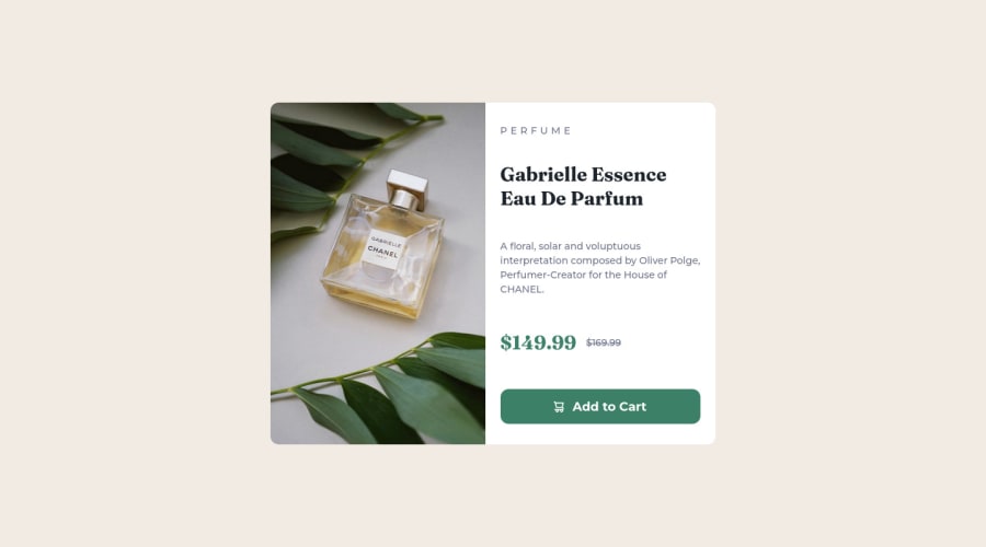
Design comparison
Solution retrospective
I feel I have extensively and conveniently used Flexbox across this project.
Q1. Can any flexbox alternatives be more efficient in any of the scenarios? (Below is the list of places I used flexbox:
- Alignment of Discounted and MRP prices.
- Within the Call-to-action Button for the Icon and Text's Alignment.
- In Desktop Design, Centering the Card Component vertically and horizontally.
- In Desktop Design, Flexing Image and Description within card to Row direction.
- In Desktop Design, Spacing a Column Flex of Card Description elements.)
Q2. Suggestions/Improvements to structure responsive bits in the code. (style.css)
Q3. I have not used img HTML elements for the Card image throughout this project, I used background-image CSS Rule instead, Will this impact SEO and Search results? And is my implementation considered as best practice in the industry?
Q4. Is there a more elegant way to Round corners of our divs, in this case. I had to repeat border-radius at 2 places, one for image div and the other for the card. Can this be improved?
Thanks for reviewing, in advance. Stay safe & take care :)
Community feedback
- P@dwhensonPosted over 2 years ago
Hey Rizwan, lovely job on this one, the component looks great and responds well. 🥳
Here's some general points to consider:
- Check the headings issue in the accessibility report. What this means is that you should use the <h1> headings as the single, main heading of your web page, followed by the <h2> headings, then the less important <h3> headings, and so on, without skipping a level.
This is important as many people using assistive tech to access your pages will navigate the site based on the heading structure. At the moment this wouldn’t work with your HTML as you skip and level and use a
h4(presumably as it's smaller?).-
I'd add a hover state on the button, and change the curser to pointer. I think strictly speaking we shouldn't but it's kinda expected behaviour now.
-
The entering of your component appears to be in a media query? As such at smaller widths it pops up to the top of the viewport. I'd suggest you just keep the body with display flex throughout (I often just use grid and place-items: center).
With regard your questions,
Q1 - You could perhaps inline the svg and then use
display: inline-flex;just saves one network request, but not a big deal!Q2 - This can be a bit tricky, but I would try and do without the breakpoint to change from columns to row flex direction, and use flex-wrap and a min-width on either the the
previewordetailselements. Check out Every Layout by Andy Bell and Heydon Pickering for more o this and how far you can take flex box!Q3 - I would probably use a img on this one as there's no text over the image, and it is directly related to the text. I'm not sure about accessibility and CSS background images, but the img approach works. Also saves having an empty div, which is always a bit of a warning to me.
Q4 - You could use a utility class for this perhaps? The other option could be to set the radius as a custom property? That way you can at least adjust the size easily, if not the application!
Hope this helps a bit, lovely job over all!
Cheers Dave
Marked as helpful1@mdrizwanfkPosted over 2 years ago@dwhenson
Hi Dave, Thanks for the compliment. I appreciate your suggestions. I understand and agree on all your points.
Thanks again for the feedback.
0
Please log in to post a comment
Log in with GitHubJoin our Discord community
Join thousands of Frontend Mentor community members taking the challenges, sharing resources, helping each other, and chatting about all things front-end!
Join our Discord
