Design comparison
Community feedback
- @R3ygoskiPosted 7 months ago
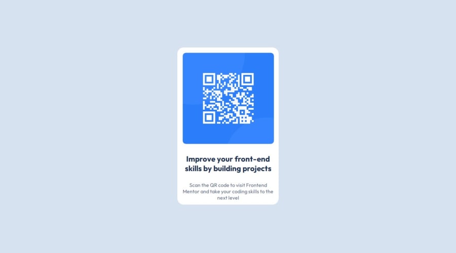
Hello David, congratulations on completing your project! It looks very similar to the proposed design, so well done!
I'd like to give you some tips regarding your HTML, specifically about semantics. Semantic markup is crucial not only for SEO but also for accessibility. Here are some suggestions for improving the semantic structure of your code:
- Instead of <div class="container">, consider using the <main> tag. This tag represents the main content of the document, and it's recommended to have it immediately after the <body> tag.
- Instead of <div class="card">, consider using the <article> tag. This tag is suitable for self-contained content that can be independently distributed or reused.
I also noticed that you're using an <h2> tag, but for accessibility purposes, it's best to use an <h1> tag. Every page should have at least one <h1> heading, and it's important not to skip heading levels. You can read more about this: W3School - Headings.
Once again, congratulations on your project! Keep practicing and improving. If you have any questions, please feel free to ask, and I'll do my best to help!
Marked as helpful0@david-malpicaPosted 7 months ago@R3ygoski Thanks for your feedback, i soon update the project with your recommendations (i try yo improve my english).
I'm excited to continue solving new challenges, regards.
0
Please log in to post a comment
Log in with GitHubJoin our Discord community
Join thousands of Frontend Mentor community members taking the challenges, sharing resources, helping each other, and chatting about all things front-end!
Join our Discord
