Not Found
Not Found
Not Found
Not Found
Not Found
Not Found
Not Found
Not Found
Not Found
Not Found
Not Found
Not Found
Not Found
Not Found
Not Found
Not Found
Not Found
Not Found
Not Found
Not Found

Submitted

Responsive card using FlexBox.

@diogohrq

Desktop design screenshot for the 3-column preview card component coding challenge

This is a solution for...

  • HTML
  • CSS
1newbie
View challenge

Design comparison


SolutionDesign

Solution retrospective


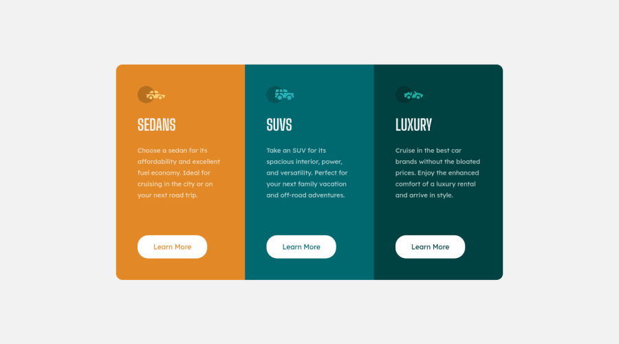
Can someone explain to me why the flex-items don't follow the border-radius that i defined in the flex-container? I searched about it but i could not find anything.

Community feedback

@VCarames

Posted

Hey there!👋 Here are some suggestions to help improve your code:

  • The purpose of the Main Element is to identify the main content of your page. It is not the container of you component. After the main element, you want add a container to wrap you separate components in.

  • The car images/icons in this component are purely decorative; They add no value. So their Alt Tag should left blank and have an aria-hidden=“true” to hides them from assistive technology.

  • Implement a Mobile First approach 📱 > 🖥

With mobile devices being the predominant way that people view websites/content. It is more crucial than ever to ensure that your website/content looks presentable on all mobile devices. To achieve this, you start building your website/content for smaller screen first and then adjust your content for larger screens.

If you have any questions or need further clarification, let me know.

Happy Coding! 👻🎃

Marked as helpful

1

@diogohrq

Posted

@vcarames Thanks for the tips, i'll be paying more attention to that !

0
Vanza Setia 27,795

@vanzasetia

Posted

Hi, Diogo! 👋

Nice work on this challenge! 👍

One suggestion I have is to leave the alternative text empty for all the car icons. They don't provide the users with any information. This will tell the screen reader to simply skip over the image.

For your information, it is possible to make the site responsive with no media queries. I recommend taking a look at my solution to know how to do that. You can read the README to learn more about the technique that I used.

I hope this helps! Happy coding!

1

@diogohrq

Posted

@vanzasetia thanks for the tips, your solution really helped me.

1

Please log in to post a comment

Log in with GitHub
Discord logo

Join our Discord community

Join thousands of Frontend Mentor community members taking the challenges, sharing resources, helping each other, and chatting about all things front-end!

Join our Discord