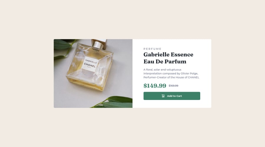
Design comparison
Solution retrospective
- Have I made a good use of the BEM methodology?
- Is bad to use div as a responsive image?
Community feedback
- @MelvinAguilarPosted about 2 years ago
Hi @kutu-dev 👋, good job completing this challenge, and welcome to the Frontend Mentor Community! 🎉
Is bad to use div as a responsive image? It depends on the situation, although it is not recommended to have an empty <div> in your HTML code.
Additionally, In this challenge, you should not use the background property to set the image because this image has semantic meaning. Use the CSS background property if the image is not part of the content.
Here is an alternative to use as a background:
- You can use a <picture> tag when you need to change an image in different viewports. Using this tag will prevent the browser from loading both images, saving bandwidth and preventing you from utilizing a media query in your CSS file to modify the image.
Example:
<picture>
   <source media="(max-width: 500px)" srcset="./images/image-product-mobile.jpg">
   <img src="./images/image-product-desktop.jpg" alt="your_alt_text">
</picture>
Good job, and happy coding! 😁
Marked as helpful1 - @Toch007Posted about 2 years ago
Hello and congratulation on successfully finishing this challenge. However, I just wanted to point out something about your HTML code. A "button" element cannot have a "div" element as a child element. E.g <button><div></div></button>, is not an accepted practice. If I may suggest, you may use <button><svg></svg>Add to cart<button>. I hope this helps. Happy coding
1 - @AdrianoEscarabotePosted about 2 years ago
Hi Kutu, how are you?
Welcome to the front-end mentor community!
I really liked the result of your project, but I have some tips that I think you will enjoy:
To align the content in the center of the screen we can use
flex-boxorgrid, feel free to choose one of the two:Flex:
body {
    display: flex;
    align-items: center;
    justify-content: center;
    min height: 100vh;
    margin: 0;
    padding: 0;
}
Grid:
body {
    display: grid;
    place-content: center;
    min height: 100vh;
    margin: 0;
    padding: 0;
}
The rest is great!
I hope it helps... 👍
1
Please log in to post a comment
Log in with GitHubJoin our Discord community
Join thousands of Frontend Mentor community members taking the challenges, sharing resources, helping each other, and chatting about all things front-end!
Join our Discord
