Submitted 8 months ago
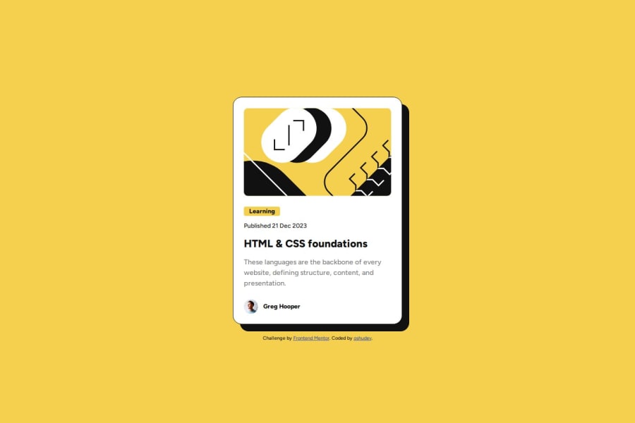
Responsive card using CSS Grid, Flexbox, Mobile first, and CSS clamp
#bem

@oshudev

Design comparison
SolutionDesign

Solution retrospective
What are you most proud of, and what would you do differently next time?
The structure is relatively simple. I use BEM to name my css classes and structure them in a way it's easy to understand. In addition to that, I got the idea on how to structure it properly since the figma file is free. It helped me a lot when structuring the content.
What challenges did you encounter, and how did you overcome them?The challenge is simple I didn't encounter any problem.
What specific areas of your project would you like help with?I always use @import to use fonts with google fonts. When I tried to use @font-face to use the local font provided, it seems it don't work. I don't what's the problem so I use the google font link.
Community feedback
Please log in to post a comment
Log in with GitHub
Join our Discord community
Join thousands of Frontend Mentor community members taking the challenges, sharing resources, helping each other, and chatting about all things front-end!
Join our Discord