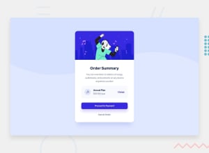
Design comparison
Solution retrospective
-
About the responsiveness of card. Is it ok like this or not?
-
My HTML construction?
-
Bootstrap classes, maybe in some places I should use another ones? E.g. for rounded corners.
-
Code cleaniness. Maybe some places dublicates and can be less of it?
Community feedback
- @grace-snowPosted almost 3 years ago
Well done on your first challenge attempt, it’s always hard to get started
I’m afraid this needs quite a bit more work. The html semantics aren’t right on this and it looks quite scrambled for me on mobile, with some content cut off screen.
First thing I strongly recommend you do is lose the bootstrap. It’s holding you back, not helping you learn. (Even if you decide to keep it, there is no reason to import popper and JavaScript in a non js challenge). You will learn much better css if you don’t use any libraries or frameworks until you’ve built up really solid foundations on your own
Other suggestions
- to make your report errors go away, use a main element - read about landmarks on MDN
- it’s essential for headings to go in order. Every page needs to have a h1 too. You can’t start at a low level heading like h5. (It has absolutely nothing to do with font size)
- with interactive elements really think about which ones to use. Anchor tags are for navigation, buttons are for actions (like toggling content or submitting a form)
- look up a bit more about how and when to write alt text on images. Learn the differences with decorative/meaningless images vs important content
- in css the biggest issue on mobiles is caused by the height 100vh. Change that to min-height so it can grow when needed
- related, don’t do max widths in % or you will lose control of the layout. 50% of my small iPhone is going to be a lot smaller than 50% of my partners large Motorola. Instead use max width in rem (or px if you’re not sure about rem yet)
- I suggest trying to write better class names. These are hard to read atm. It’s usual to use kebab-case for class names (or there are more specific conventions like BEM but I wouldn’t look into anything like that at the moment, just focus on making them readable and meaningful). You can tie them to the content of the design a bit more (eg “card” “link” “link-grey” etc) as one idea, or just add dashes or change casing so they are easier to read
- always add focus-visible styles to anything interactive. There aren’t designs for these but they are essential - they don’t need to be pretty, just obvious and clear so keyboard users know where they are when tanning through a page.
I hope this helps you. Good luck
Marked as helpful2@pjooklasPosted almost 3 years ago@grace-snow Thanks, now I actually realised, that I couldn't use bootstrao, but becuase I was learning it at the moment, I wanted to use it :)
0
Please log in to post a comment
Log in with GitHubJoin our Discord community
Join thousands of Frontend Mentor community members taking the challenges, sharing resources, helping each other, and chatting about all things front-end!
Join our Discord
