

Design comparison

Solution retrospective
Is there a better way to align the text and icon within the button? Similarly, the reduced price and the price - is my solution a good one? How could I have organised the code better?
Could I have improved the accessibility?
Community feedback
- @adityaphasuPosted over 1 year ago
Hi! Good job completing the challenge!🙌🏻
I really like the grid work ^_^
- As for your question , you can align the icon and the text inside the button using
display:flexinstead of giving margins to the icon. You can do it like this:
button { display: flex; justify-content: center; align-items: center; gap: 1rem; }- In the code snippet
display:flexmakes the button a flex container. justify-content:centercenters the button content along the x-axis.align-items:centercenters the button content along the y-axis.gap:1remjust adds some little gap between the icon and the text.
After applying the above code snippet make sure to remove the css from your svg:
svg {
vertical-align: middle;            //
margin-inline-end: 1em;            Remove all of this
margin-block-end: 3px;         //
}
You can try the same thing for the price and crossed out price as well and if you want to learn more about flex you can read it about here and play around with it's other properties.
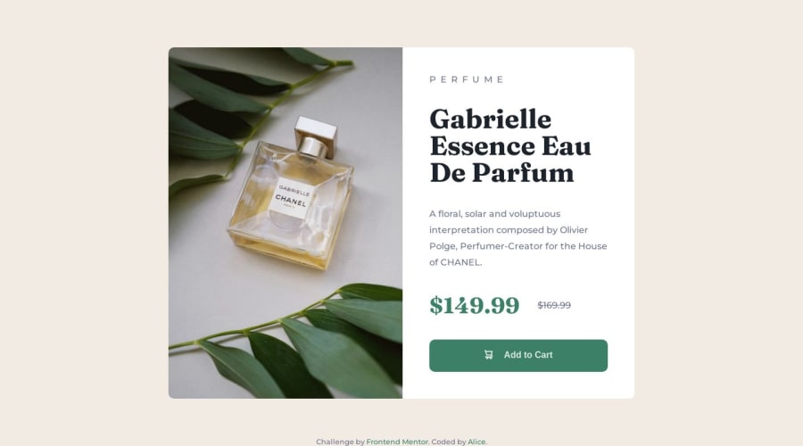
🖼️ As you can see there are 2 images in the images folder (one for desktop and one for mobile). It seems you have'nt applied the mobile one. You can do it using a <picture> element like this:
<picture> <source srcset="images/image-product-mobile.jpg" media="(max-width: 400px)" > <img src="images/image-product-desktop.jpg" alt="perfume bottle" > </picture>- In the code snippet the
<picture>element is used to switch the images . - The
sourcesets the image for the mobile one whilemediaattribute adds a media query as to when should the img switch (here its atmax-width: 400px). - So basically your image will be desktop one for larger devices and for smaller ones it will be switched to the mobile one.
📱 For accessibility , you should wrap the the whole card inside a <main> tag like this:
<body> <main> <div class="card"> // Rest of the code </div> </main> </body>- The
<main>tag provides a clear and meaningful structure to the HTML as it helps assistive technologies and search engines to understand the the main content of a document.
I hope this answers your questions.
Good luck and keep coding!🕺🏻
Marked as helpful0@SaheedattPosted over 1 year ago@adityaphasu Thank you very much for the feedback. I have made changes to the button. I don't quite understand the : <picture> <source srcset="images/image-product-mobile.jpg" media="(max-width: 400px)" > <img src="images/image-product-desktop.jpg" alt="perfume bottle" > </picture> This is the first time I am learning about it. I will look into it and make the necessary changes.
0@alice173Posted over 1 year ago@adityaphasu , super helpful thank you! I did think afterwards I should have used flex, I normally do but I was challenging myself to not be so reliant. I"m going to redo the whole thing using flex instead of grid and I'll integrate your feedback. Thanks again!
1 - As for your question , you can align the icon and the text inside the button using
- @Aimal-125Posted over 1 year ago
You can align text and icon by wrapping them in two separate spans inside button and set display property to flex for button. Then justify-content: center; align-items: center; gap: 10px;
For accessibilty use semantic tags of html. Put your code inside <main> tag.
0


Please log in to post a comment
Log in with GitHub
Join our Discord community
Join thousands of Frontend Mentor community members taking the challenges, sharing resources, helping each other, and chatting about all things front-end!
Join our Discord