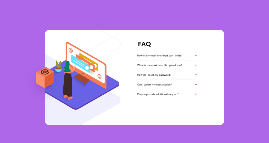
Responsive Card, used tons of things.
Design comparison
Solution retrospective
Done, I know that this project is simple, but it took me a long time to finish, tons of new things for me to work with.
Community feedback
- @pikapikamartPosted over 3 years ago
Hey, awesome work on this one. The desktop layout looks really nice, just needed for the right color for the
linear-gradientso that it matches the design. The site is responsive but the breakpoint using 1250px is too big for the whole mobile state to occupy. Desktop layout could use more of those screen time, but hey, mobile state looks great.Here are some other suggestions for the site:
- It would be great to have this markup:
<main /> # contain the FAQ
<footer /> # contains the attribution
This way, all content of your page will be inside their own respective landmark element.
- You don't really need to use the
headeron this one. Typically, a primaryheaderwill only contain the topmost part of the site which includes the site-logo, navlinks and could be other controls,headercould be used insidearticleas well for sectioning. Replacing it withdivon this would be nice. - For this component, all images that are used, the box, the illustration, the lines, the arrow-icon on the dropdown, all of those are only acting as decoration on the site and doesn't really give much content to the overall content of the site. Decorative images should be hidden for screen-reader at all times by using
alt=""andaria-hidden="true"to theimgtag or onlyaria-hidden="true"if you are usingsvginstead ofimgtag. - Only use descriptive
alton images that are meaningful and adds content to the site otherwise hide the image for screen-reader users. - I just saw the the
mainandfooter, those landmarks are used differently on this one. - Now, when you are creating an interactive component, make sure that it is using an interactive element. Using
lias toggle for the accordion is not accessible because it will only be toggled using mouse and no other peripherals could interact with it. For this one, you can usedetailstag. That is much better and accessible from the start and you don't need to manipulate its attribute. - Also, those
hrcould just be replaced by usingborder-bottomon each of the.accordion, this way, no extra tags are created.
Aside from those, great job again on this one.
Marked as helpful0 - @VidottizzzPosted over 3 years ago
I appreciate so much your feedback, very, very informative, i didn't noticed the gradient, hahaha. And this HTML structures hints, i'm very grateful for that! Thank you so much, from a pokémon lover to another! ( i got a Cubone and his 3 ghost friends tattoed)
1
Please log in to post a comment
Log in with GitHubJoin our Discord community
Join thousands of Frontend Mentor community members taking the challenges, sharing resources, helping each other, and chatting about all things front-end!
Join our Discord
