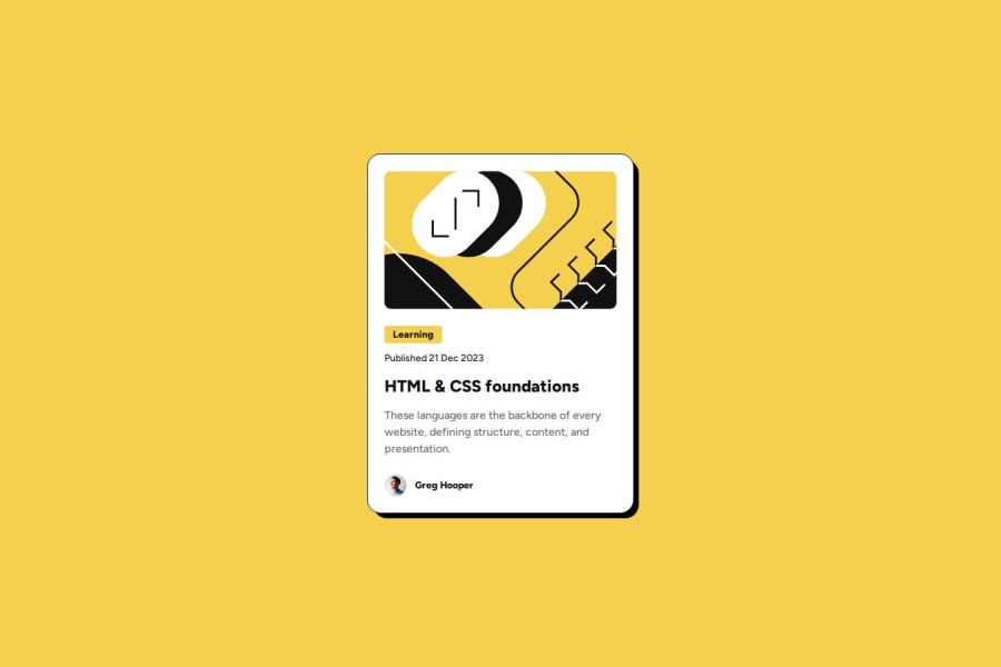
Not Found
Not Found
Not Found
Not Found
Not Found
Not Found
Not Found
Not Found
Not Found
Not Found
Not Found
Not Found
Not Found
Not Found
Not Found
Not Found
Not Found
Not Found
Not Found
Not Found

Submitted

Responsive card solution using HTML5, CSS3, and Flexbox

P
Neil 10

@Neil10241126

Desktop design screenshot for the Blog preview card coding challenge

This is a solution for...

  • HTML
  • CSS
1newbie
View challenge

Design comparison


SolutionDesign

Solution retrospective


What are you most proud of, and what would you do differently next time?

I am proud of modularizing the design guideline using CSS variables, making it easy to reference and modify. Next time, I would try using Sass to structure the code, which would make the CSS more concise.

What challenges did you encounter, and how did you overcome them?

Initially, I encountered issues with shadow effects. I tried using box-shadow to create the effect, but it didn't feel quite right. Later, I used ::before and ::after elements to handle the shadow effects.

What specific areas of your project would you like help with?

In constructing the CSS, I developed with a desktop-first approach and added @media queries whenever mobile-specific properties were needed. I'm not sure if this development process is a good idea, or if integrating all mobile CSS into @media would be easier to understand.

Community feedback

MaelkMark 150

@MaelkMark

Posted

Looks cool, great job! But you should't use multiple media queries for the same breakpoint. Declare only one and then put all the needed styling inside it. It's important because if you want to change the style of the card later and need a different breakpoint, you'll have to change it everywhere in the code! And using only 1 media query for 1 breakpoint is also much cleaner, easier to maintain and understand for other people and for you too.

0
MikDra1 5,990

@MikDra1

Posted

Limited Browser Support for :root Variables:

  • The :root variables might not work correctly in older browsers. Providing fallbacks could improve compatibility. Here is a quick VIDEO about how you can create a fallback to the variable

Font Sizing and Scaling:

  • If the font size is defined in pixels (px), it could create scaling issues on different devices. Using em or rem would be more flexible. And here is how we use rems:
html {
font-size: 62.5% // It means that 1rem = 10px. From this it is easier to use rem
}

p {
font-size: 1.6rem; // Here this paragraph font-size will be 16px;
}

If you don't understand it already here is a VIDEO

Hope you found this comment helpful 💗

Good job and keep going 😁😊😉

0

Please log in to post a comment

Log in with GitHub
Discord logo

Join our Discord community

Join thousands of Frontend Mentor community members taking the challenges, sharing resources, helping each other, and chatting about all things front-end!

Join our Discord