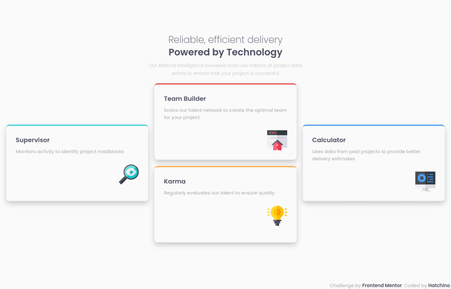
Not Found
Not Found
Not Found
Not Found
Not Found
Not Found
Not Found
Not Found
Not Found
Not Found
Not Found
Not Found
Not Found
Not Found
Not Found
Not Found
Not Found
Not Found
Not Found
Not Found

Submitted

Responsive card section CSS/HTML

Lea 160

@Hatchino

Desktop design screenshot for the Four card feature section coding challenge

This is a solution for...

  • HTML
  • CSS
1newbie
View challenge

Design comparison


SolutionDesign

Solution retrospective


I'm currently stuck on a challenge, in the meantime I tried this one which is simpler. Feel free to leave any suggustions !

Community feedback

@VCarames

Posted

Hey there! 👋 Here are some suggestions to help improve your code:

  • The Main Element should only wrap the card components. Since that is your main content.

  • The introductory text should be wrapped in a Header Element.

  • The “Reliable, efficient delivery Powered by Technology” is one single heading so the entire thing should be wrapped in a single <h1> Heading along with a Span Element.

  • The Article Element is not the best choice for wrapping these card components. In order to use the Article Element the components need to be able to make sense on its own and be independently distributable (can be used in on another site). These card components cannot do neither. Instead, you want to wrap each individual testimonial component in a Div and give them a class.

  • Add a third layout to make the transition from mobile 📱 -> desktop 🖥 views smoother.

If you have any questions or need further clarification, let me know.

Happy Coding! 👻🎃

Marked as helpful

0

Lea 160

@Hatchino

Posted

Hi @vcarames

  • I add the header and the card components together with the main element because I wanted everything centered on the page
  • I see what you mean to make a smoother transition but I don't know how can I do this Thank you for your help !
0

@VCarames

Posted

@Hatchino

The only purpose of the main is identify the main content of your site. You are using it as a container. Which is not the correct way of doing things.

If you goal is to center you content, then move all these properties to the Body Element:

 main {
      width: 100%; (delete)
      height: 100vh; (change to `min-height`)
      display: flex;
      flex-direction: column;
      align-items: center;
      justify-content: center;
    }
0

@Mohammedabbas7

Posted

hello, nice solution. I just wondering why you used internal CSS instead of external CSS.

0

Please log in to post a comment

Log in with GitHub
Discord logo

Join our Discord community

Join thousands of Frontend Mentor community members taking the challenges, sharing resources, helping each other, and chatting about all things front-end!

Join our Discord