Responsive Card Preview with Vanilla HTML and CSS

Solution retrospective
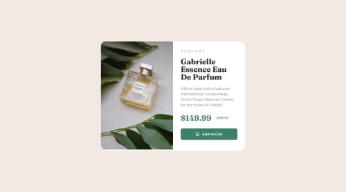
Trying to implement some best practices and also utilizing media query!
What challenges did you encounter, and how did you overcome them?Googled to figure out how to switch to different pictures in different device sizes.
What specific areas of your project would you like help with?My "card" component has a height of 455.5 instead of 450 as set in Figma when viewed in desktop view, this results in a white space under the image as the desktop image has a height of 450. However, I couldn't figure out why it was behaving this way. I tried solving this problem by switching between min-height and height set on different components, switching between padding and margin, and also not using border-box - none of those worked tho... Any thoughts on why?
Please log in to post a comment
Log in with GitHubCommunity feedback
No feedback yet. Be the first to give feedback on Gina Wang's solution.
Join our Discord community
Join thousands of Frontend Mentor community members taking the challenges, sharing resources, helping each other, and chatting about all things front-end!
Join our Discord